The annual rate of return ranking of major asset classes over the past 10 years
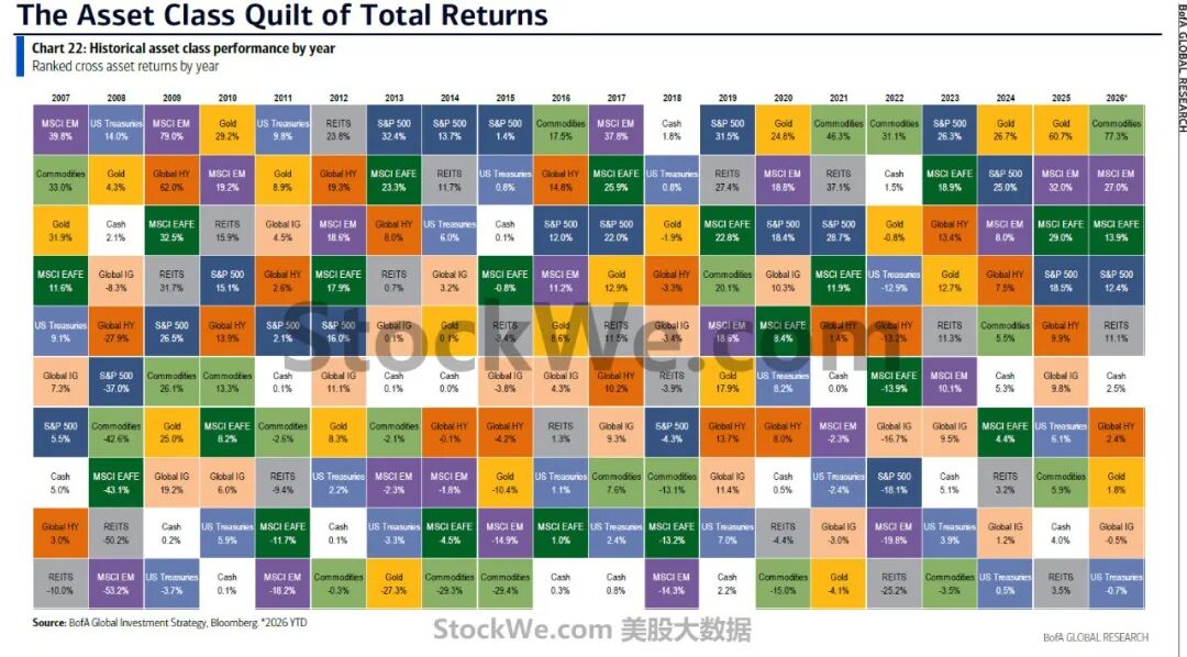
The changes in the annual return rankings of various major asset classes from 2007 to 2026 reveal a critical rule: no single asset can stay at the top of the ranking for a long time, and the "king" of the market keeps rotating.
1. The most important signal in 2026: Commodity assets are becoming the absolute winner
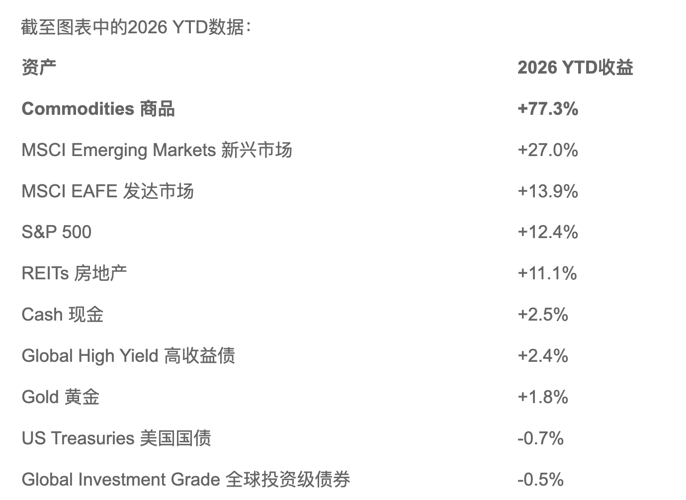
The most striking figure is Commodities +77.3%.
And this is not a "slight lead" in the ordinary sense, but an overwhelming lead that leaves other assets far behind.
The second-ranked emerging market only records a 27% return, and the return of commodities is nearly 3 times that of it.
This indicates that the core market trading logic in 2026 has changed significantly: Capital is shifting from traditional financial assets to physical assets such as resources, energy and raw materials.
2. What really deserves attention is that gold is giving way to "commodities"
The research team of Tradesmax learned that if you only look at the performance of the past two years, it is easy to draw the conclusion that "gold is the biggest winner".
In 2024:
Gold +26.7%
In 2025:
Gold +60.7%
Gold has performed very strongly for two consecutive years.
But by 2026, the return of gold is only:
+1.8%
At the same time, the commodity index directly reaches:
+77.3%
This means a very important change:
The market is no longer only trading around "risk aversion", but has begun to shift to "resource shortage".
The rise of gold more reflects the impact of factors such as:
The US dollar, inflation, central bank gold purchases, geopolitics, fiscal deficits, and risk aversion.
However, a sharp rise in commodities often means a more direct imbalance between supply and demand.
For example, when supply bottlenecks appear in energy, industrial metals, agricultural products and other sectors, the subsequent price rise will further transmit to the entire economic system.
Therefore, looking at this chart in the macro environment of 2026, Tradesmax believes that what is most worth paying attention to is not "whether gold can still rise", but:
Why has the commodity index suddenly become the asset with the highest return across the whole market?
This may indicate that the market is pricing a deeper theme behind it — the repricing of global physical assets.
3. The "champion" of the past 20 years has been changing all the time
The most interesting part of this chart is actually the horizontal view of the period from 2007 to 2026.
You will find that:
In 2007, it was MSCI Emerging Markets +39.8%
In 2008, it turned to US Treasuries +14.0%
In 2009, the emerging market soared by +79.0%
In 2010, gold rose by +29.2%
In 2011, US Treasuries ranked first
In 2012, REITs ranked first
In 2013, S&P 500 ranked first, with a return of +32.4%
In 2014, S&P 500 ranked first, with a return of +13.7%
In 2015, traditional assets such as commodities and gold performed very poorly
In 2016, commodities rebounded again
In 2017, the emerging market ranked first, with a return of +37.8%
In 2018, cash/US Treasuries performed relatively better
In 2019, S&P 500 recorded +31.5%
In 2020, gold recorded +24.8%
In 2021, commodities recorded +46.3%
In 2022, commodities recorded +31.1%
In 2023, S&P 500 recorded +26.3%
In 2024, gold recorded +26.7%
In 2025, gold recorded +60.7%
Then in 2026:
Commodities +77.3%.
This is the so-called "asset rotation".
4. This chart actually tells investors: do not blindly believe in a single asset
Take gold as an example.
Gold in 2020: +24.8%
In 2021: around +0.0%
In 2022: -0.8%
In 2023: +13.4%
In 2024: +26.7%
In 2025: +60.7%
As of now in 2026: +1.8%
You will find that gold does not keep rising all the time.
If you thought "gold is always the best asset" because it rose by 60.7% in 2025, you would find in 2026 that capital has already switched to commodities.
The same thing has happened to stocks, bonds, emerging markets and REITs.
There is no permanent number one, only the number one under different macro cycles.
This is also the core significance of the "Asset Class Quilt" chart.
5. The year 2022 is actually a very important watershed
In 2022:
Commodities +31.1%
While: S&P 500 -18.1%
MSCI EAFE -18.1%
MSCI EM -16.7%
Global IG -19.8%
REITs -25.2%
US Treasuries -12.9%
In other words, 2022 was almost a year when traditional stocks and bonds suffered a "double kill", but commodities became the biggest winner.
This is a typical scenario:
Inflation → Rising interest rates → Compressed stock valuation → Falling bond prices → Commodities benefit.
Now in 2026, commodities have once again posted performance far exceeding other assets, and it is worth thinking about:
Is 2026 forming a "physical asset cycle" similar to that of 2022?
Of course, the macro backgrounds of the two periods are not completely the same, so we cannot simply copy the trading logic of 2022.
6. There is also a very interesting phenomenon: stocks are not that bad
Many people who see the 77.3% return of commodities in 2026 may think that "there is no opportunity for stocks".
In fact, that is not the case.
2026 YTD: S&P 500 +12.4%
MSCI EAFE +13.9%
MSCI EM +27%
This shows that stocks still generate positive returns, and the emerging market performs very strongly.
In particular:
MSCI Emerging Markets +27%
Has clearly outperformed the S&P 500.
This shows that the current situation is not a simple one-way capital migration from "stocks to commodities", but more like:
US large-cap stocks → Overseas markets/Emerging markets + Physical assets
This is a broader global asset reallocation.
7. The performance of bonds is worthy of vigilance instead
In 2026:
US Treasuries -0.7%
Global investment grade bonds -0.5%
These two figures do not seem to have fallen much, but in the current context where commodities have a 77.3% return, their implications are completely different.
Because the traditional 60/40 portfolio:
60% stocks + 40% bonds
Has relied heavily on the negative correlation between stocks and bonds for decades.
But if the following situation appears in the future:
Rising commodities + Inflationary pressure + High interest rates + Rising stock prices + Weak bond performance
Then the risk-return structure of the traditional 60/40 portfolio needs to be re-evaluated.
This is also one of the biggest inspirations of this chart for long-term asset allocation.
8. From the perspective of US stock investment, what this chart really deserves attention is the "second-tier opportunities"
If commodities really enter a strong cycle, the most worthy of attention may not only be directly buying commodities.
Because the rise of commodities will generate huge transmission effects across the industrial chain.
For example:
Rising energy prices → Increased profits of oil and gas companies
Rising copper prices → Increased profit elasticity of copper mining companies
Rising uranium prices → Uranium mining/nuclear power industry chain benefits
Rising gold prices → Increased profit elasticity of gold mining enterprises
Rising prices of aluminum, copper, lithium and other resources → Upstream resource companies benefit
Moreover, the profit growth of resource companies is often more dramatic than the rise of commodity prices themselves.
Take a simple example:
If the cost of a mining enterprise is 50 US dollars, and the commodity price rises from 70 US dollars to 100 US dollars, the commodity itself rises by 43%, but the gross profit of the enterprise may increase from 20 US dollars to 50 US dollars, with a 150% increase in profit.
Therefore, if the 2026 commodity super cycle continues, what is really worth studying behind this chart is:
Commodities → Upstream resources → Equipment manufacturers → Infrastructure → Enterprise capital expenditure
The entire industrial chain above.
9. Tradesmax believes that this chart can be summarized into a sentence very suitable for US stock investors
The market in the past 20 years has never been "a certain asset keeps rising forever", but every macro cycle will produce a new asset champion.
The champion of 2009 was the emerging market.
The champion of 2010 was gold.
The champion of 2013-2014 was US stocks.
The champion of 2016 was commodities.
The champion of 2017 was the emerging market again.
The champion of 2019 was US stocks.
The champion of 2020 was gold.
The champion of 2021-2022 was commodities.
The champion of 2023 was US stocks.
The champion of 2024-2025 was gold.
By 2026, commodities are far ahead with a 77.3% rate of return.
Therefore, what this chart is most worth paying attention to is not "which asset has the largest increase this year", but:
Why is the market champion switching from gold to commodities?
If this trend continues, the real big opportunities in the US stock market next may not only lie in traditional AI technology stocks, but may gradually spread to energy, copper, uranium, mining, industrial equipment, infrastructure and companies that benefit from the global resource capital expenditure.
This is also the most valuable signal of this BofA chart for 2026 investment from Tradesmax's perspective.
This article is from the WeChat official account "Tradesmax" (ID: tradesmax), Author: StockWe.com, 36Kr is authorized to release it.