Foldable iPhones and touchscreen Macs are coming thick and fast, is Apple about to make life difficult for developers again this round?
The past week, Apple has presented users with two somewhat unfamiliar choices one after another.
On October 23, iPhone's first foldable smartphone iPhone Duo officially went on sale. Unlike the iPhones people have been familiar with for more than a decade, it moves the status bar, navigation bar and even the Dynamic Island to the side of the screen, and after unfolding, there are quite a few interaction methods that have never existed in traditional iOS.
A few days later, on October 28, Apple released its first MacBook Pro with touch screen support. The touch screen for laptops, which Steve Jobs once considered not ergonomic, has finally appeared on Apple's own computers.
Apart from the fact that the MacBook Pro replaced the notch with the Dynamic Island, which is an expected change that many users have long anticipated, the other interaction designs of the two new products have sparked considerable controversy.
Some people believe that Apple has finally let go of its past obsessions, while others question whether these changes can make the devices easier to use, or just add unnecessary operational complexity? Especially for iPhone Duo, a large number of adaptation issues with third-party apps after its release have made people even more skeptical about whether Apple is fully prepared.
However, when Apple starts to redesign the interaction rules for Mac and iPhone, developers may face more headaches than users who need to re-adapt to new operation habits.
Apple's design philosophy has changed drastically, but the interaction is not necessarily better
If I had to pick the design that best represents Apple's transformation this time, I think the first one would still be the touch screen of the MacBook Pro.
In 2010, Steve Jobs publicly criticized the ergonomic issues of touchscreen laptops, arguing that it was unreasonable to lift arms for a long time to operate a vertical screen. In 2012, Tim Cook even used the metaphor of "refrigerators and toasters" to oppose forcibly merging the experiences of tablets and laptops.
More than a decade later, Apple eventually decided to bring fingers to the Mac's screen. But interestingly, Apple did not transform macOS into another version of iPadOS, but chose to add touch screen support on the basis of the original desktop interaction.
When users use a mouse or trackpad, the window buttons and menu bar remain at their traditional size. But when operating with fingers, the touch area of corresponding controls will automatically expand, and some menus and sliders will also adjust according to the input method. Users can also directly control the content on the screen through operations such as finger swiping, two-finger zooming, and drag-and-drop.
This set of designs looks quite smart. Apple does not want to sacrifice the long-standing mouse and keyboard operation efficiency of Mac, and also hopes to provide a more natural experience for touch screen users.
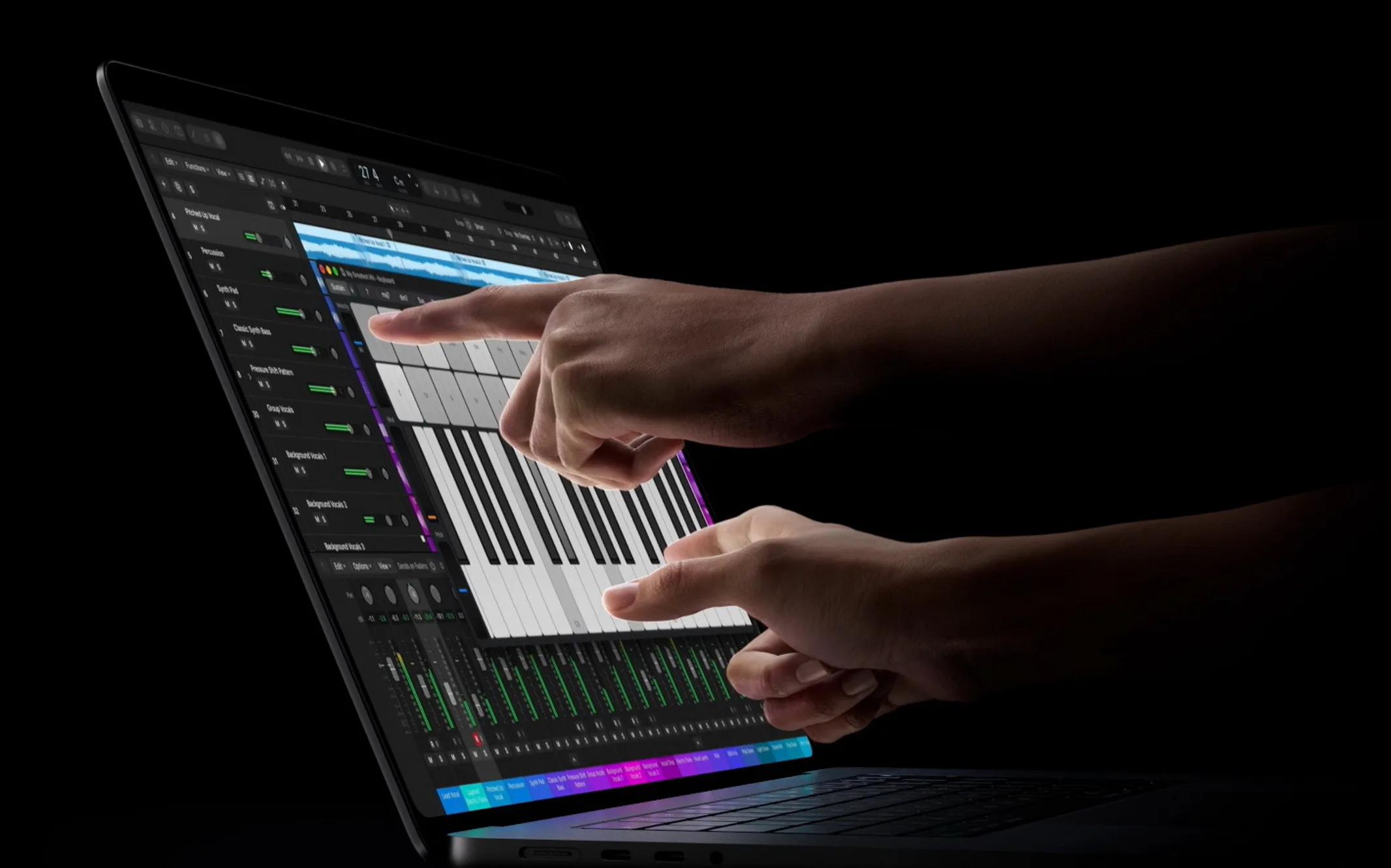
MacBook Pro, Image source: Apple
But the problem has not disappeared. The Verge found during its experience that although Apple redesigned the screen hinge, the screen still shakes when you touch it with force. More importantly, touchscreen laptops can never avoid the fatigue caused by lifting arms to operate, as well as the accuracy difference between fingers and the mouse pointer.
For scenarios such as browsing web pages and zooming in on photos, directly touching the screen is indeed intuitive. But for video editing, precise image retouching or complex multi-window office work, frequent switching between the keyboard, trackpad and screen, is it really more efficient than the original operation method?
It can only be said that at least the answer Apple gives now is not convincing enough.
Moreover, the new MacBook Pro does not adopt a 2-in-1 flip design, nor does it support Apple Pencil. Apple obviously is not prepared to make the touch screen the main operation method of Mac, but hopes it can provide more possibilities in specific scenarios.
In other words, the touch screen of MacBook Pro is more like a supplement. Users can continue to maintain their past operation habits, and almost do not need to pay learning costs for the new design.
But iPhone Duo is completely different.
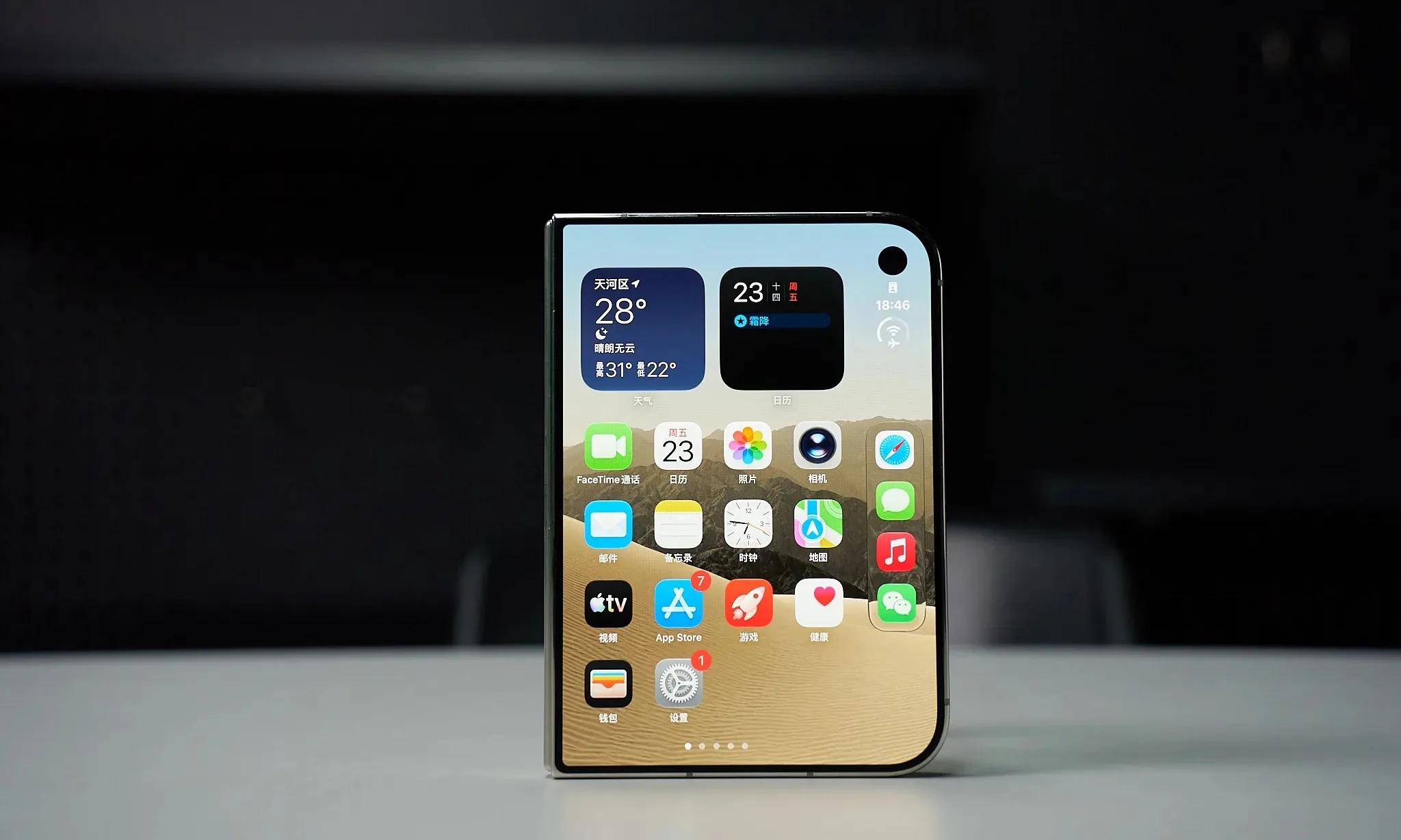
Image source: Lei Technology
In order to adapt to the 5.4-inch outer screen and 7.6-inch inner screen, Apple has almost reorganized a set of iOS interaction layouts.
The most noticeable change is that controls originally located at the top and bottom of the screen, such as the navigation bar, toolbar and Dock, are uniformly moved to the side of the screen. Apple hopes that in this way, it can save the already limited vertical space, and at the same time allow users to get a more continuous operation experience when folding, unfolding and rotating the device.
But Ars Technica pointed out that the sidebar is obviously biased towards right-hand operation, and it is difficult to reach some buttons when holding the device with the left hand. More awkwardly, although Apple moved the controls to the side to increase the content display space, when the virtual keyboard pops up, the content that can be displayed on the outer screen is still very little. The Verge also noticed another problem:
The iPhone operation habits formed over the past nearly two decades are suddenly no longer so reliable on iPhone Duo.
For example, the back button of some applications has been moved from the upper left corner to the right, but the traditional edge swipe gesture has not been completely changed accordingly. Users sometimes even need to judge whether the current application has adapted to iPhone Duo before determining where to find the familiar operation.
However, compared with the sidebar, Apple's choice on multi-tasking may be more worthy of discussion.
iPhone Duo does not simply port iPadOS to the foldable screen, but redesigns the dual-app split screen based on iOS 27. Users can open two Apps side by side, and after folding the device, they can resume one of the tasks on the outer screen. No matter from the perspective of operation logic or animation transition, this is a quite thoughtful design.
But Apple also stipulated that the two applications can only be split at a 50/50 ratio, neither can the window size be adjusted arbitrarily, nor does it support adding a free floating window on top like some Android foldable screens. This creates a strange contradiction:
Apple hopes iPhone Duo has productivity that surpasses traditional mobile phones, but it is unwilling to give users too much freedom to manage windows. It hopes users can enjoy a larger screen, but it does not directly open the full iPadOS interaction capability.

Image source: Lei Technology
Compared with the flexibility emphasized by Android foldable manufacturers such as Samsung, Apple obviously cares more about the consistency under different scenarios, and whether the operation rules are simple and easy to understand. This trade-off certainly cannot be directly defined as wrong. After all, more complex window management may not be suitable for everyone. But when Apple unifies the interaction method for all users, it also means that some people's usage needs have to be compromised for this.
The trouble does not stop there. After iPhone Duo went on sale, a large number of third-party Apps still cannot make full use of the foldable screen. After unfolding, they can only display a small window in the center of the screen, leaving large black borders on both sides.
When Apple changed a set of interaction rules that have been used for more than a decade, millions of applications originally designed for traditional iPhones obviously cannot all complete the transformation overnight. These new interaction designs have also brought a lot of troubles to developers.
Apple is busy "innovating", while developers are busy with adaptation
As early as the day iPhone Duo was released on September 9, well-known iOS developer Steve Troughton-Smith expressed his dissatisfaction on Mastodon. In his opinion, this is almost equivalent to a brand new platform suddenly appearing, and the preparation time left for developers is only:
About one month.
"The problem with those exquisite devices is that they always come with homework, and the homework is always ours." Juan Marin, editor of iOS Dev Weekly, also mentioned.
Of course, Apple has not completely ignored the situation of developers. Whether it is the touch screen of MacBook Pro or the new interface of iPhone Duo, Apple is trying its best to reduce compatibility costs through system frameworks.
On Mac, macOS 27 can automatically convert touches into traditional mouse clicks. For a large number of applications that use AppKit and SwiftUI standard controls, developers do not even need to update to achieve basic touch operations. Apple also provides new touch APIs, allowing developers to expand the actual touch area of buttons, recognize multi-touch, or adjust operations that could only be triggered by mouse hover in the past.
The same is true for iPhone Duo.
Apple provides new development tools and design specifications for foldable screens. As long as applications use standard SwiftUI and UIKit navigation components, the system can automatically move some navigation controls to the side, and adjust the layout according to the current screen size. Especially for applications that already support iPad split screen and adaptive windows, this basic adaptation may not be as difficult as imagined.
But the problem is that being able to run normally is a completely different thing from being truly suitable for the new interaction method.
After iPhone Duo was released, a developer shared his adaptation experience in the Apple Developer Community on Reddit. He said that for native applications that already have good compatibility, it may only take one to three hours, but for applications developed with the cross-platform framework .NET MAUI, he spent 19 hours and still did not complete all adjustments.
Some other developers mentioned that their application has more than 50 interfaces, which requires adjusting the position of navigation controls one by one and redesigning some split layouts for the inner screen. Fortunately, with the help of AI Coding, the originally tedious work finally only took three days. But some other developers encountered the completely opposite situation. They thought they had completed the optimization through the simulator, but after getting the real device, they found the experience was very poor, and then listed more than 30 problems that needed to be fixed.
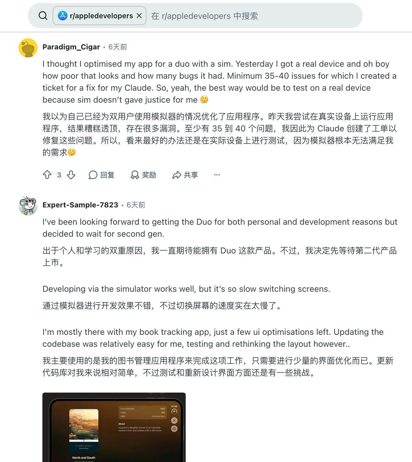
Image source: Reddit
The automatic adaptation mechanism provided by Apple is indeed effective, but the workload between different applications can still vary greatly. If developers have always used standard system components and dynamic layouts, many problems will naturally be handled by Apple. But for applications that use a large number of custom controls, fixed sizes, or require complex gestures, the new device is very likely to mean a full inspection, or even reconstruction.
Especially for applications such as games, video editing, and painting, simply enlarging the original interface does not complete the adaptation.
For example, although Apple allows developers to read the folding angle of iPhone Duo and avoid the crease in the middle of the screen, it cannot directly tell developers how to arrange the operation buttons in the half-fold state to be more reasonable.
Similarly, although MacBook Pro already allows fingers to click on most interfaces, it cannot automatically make the precise operations of professional software such as DaVinci Resolve and Blender suitable for touch screens.
From this perspective, Apple has solved a large number of technical compatibility problems for developers, but the work that really determines the quality of the interaction experience still needs to be completed by developers themselves. Moreover, the adaptation cost is only half of the problem.
More importantly, why should developers invest time in these new interactions?
Apple released a special press release before the sale of iPhone Duo, introducing third-party applications that have adapted to iPhone Duo, and there are many very interesting cases among them:
Flexibits, the developer of Fantastical, used the expanded large screen to present the calendar, tasks and navigation menu at the same time, making the usage experience on iPhone closer to that on iPad and Mac. The video editing application Detail displays the video footage and transcribed text side by side, allowing users to edit podcasts and interview content just like editing documents.
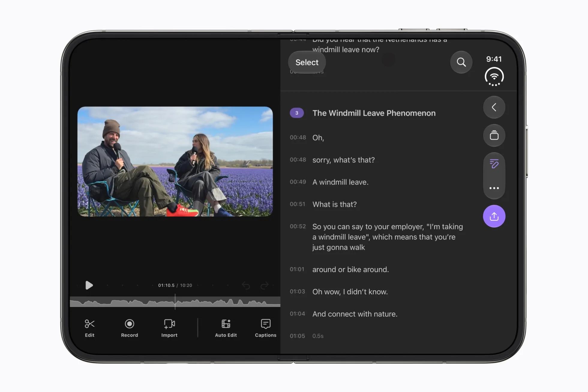
Detail, Image source: Apple
These applications have obviously found some scenarios where the foldable screen can truly improve the original experience. But in the developer discussions on Reddit, more people are considering how much return they can get by developing exclusive features for a foldable phone with a price close to 2000 US dollars and an uncertain user scale.
Some developers clearly stated that they have not even opened the simulator to check their applications, because they do not think this is worth the investment for the time being.
This attitude is not difficult to understand. For top applications such as WeChat and Netflix, adapting to Apple's new devices is almost an inevitable choice. But for independent developers with limited scale, adaptation not only means development costs, but also means testing, maintenance, and long-term investment to continue to be compatible with different devices in the future.
Especially for the touch screen of MacBook Pro, basic compatibility can already be completed through the system. If there are no functions particularly suitable for touch operation, what reason do developers have to specially redesign a set of interactions for it?
Conversely, although iPhone Duo brings more direct adaptation pressure, it may also create new opportunities for developers. For example, in the past, many tool applications were limited by the single vertical screen of iPhone, which could only make users switch interfaces repeatedly. Now, through the split layout of the inner screen, the half-fold posture and dual-screen collaboration, they have the opportunity to complete tasks that originally required multiple operations in the same interface.
This is also why, when facing the same new device, some developers think Apple is adding workload to them again, while others can't wait to start exploring new usage methods. In the final analysis, what determines whether developers are willing to invest is not only how difficult the adaptation is, but also how much value the new interaction method can bring to the application.
Final Notes
From iPhone Duo to the touchscreen MacBook Pro, Apple is breaking some interaction rules that it has adhered to for a long time.
This is certainly not a bad thing. After all, when the phone screen can be folded and the laptop finally supports direct touch, the operation methods established around the fixed hardware form in the past do need to be re-examined.
But the value of new interactions is ultimately not proven by Apple alone.
Apple can design new navigation bars, provide new APIs, and even allow developers to complete basic adaptation by modifying only a few lines of code, but it cannot create truly valuable usage scenarios for