Hands-on Test of GPT Images 2.5: It Can Even Make Sense of Messy Scribbles, and Amateur Doodlers With Unpolished Drawing Skills Are Finally About to Turn Things Around.
The puppy drawn on the following lost-and-found notice (to be precise, a notice to help a lost puppy find its owner) is rendered in a very sketchy, scribbled style.
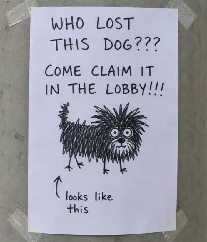
Its body is drawn as a mess of tangled lines, eyes wide open, and tail sticking up in mid-air. When we feed this sketch to ChatGPT Images 2.5, it generates a fluffy, alert-looking puppy. When placed side by side with the actual photo of the dog, the result is not perfectly identical, but the slightly dishevelled vibe is surprisingly close to the real animal.
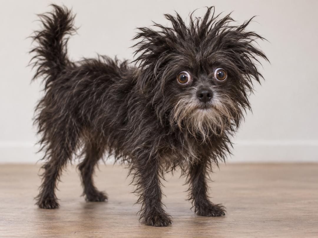
What ChatGPT Images 2.5 imagines the dog looks like based on the lost-and-found notice
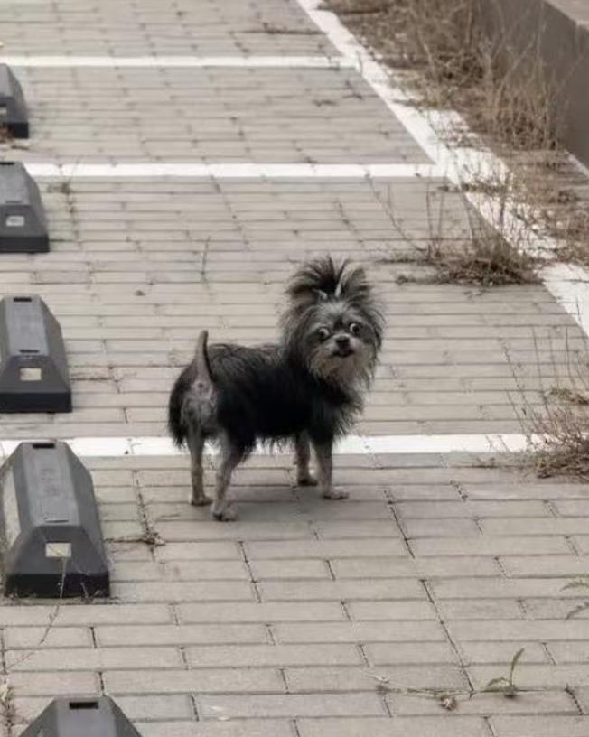
This is what the dog actually looks like
Observing how AI interprets an inaccurate drawing can reveal far more about its capabilities than watching it generate a polished, perfect image from scratch.
Today, OpenAI released ChatGPT Images 2.5, which highlights improved image fidelity, precise editing, and consistency across multiple rounds of revisions, with generation latency reduced by up to 50% compared to the 2.0 version.
What APPSO cares more about this time around is another question: when you feed it sketches, photos of people, and specific aesthetic requirements, how much of the final output actually reflects your original intent?
Understand Your Intent Perfectly
Some ideas are far easier to draw than to describe in words.
The newly added Sketch feature gives users a dedicated canvas. According to the official help documentation, type @Sketch in the ChatGPT input box, and you can draw out the basic outline, then add supplementary text requirements. The position, size and shape of elements can be directly marked on the canvas, without the need to write all descriptions in full sentences.
Spring has arrived for amateur "soul painters": as long as you can leave traces on the screen, you can leave the rest to AI.
The sketch I drew is very simple: two inward-leaning buildings on both sides, a tiny figure hanging in the middle, and the film title written at the bottom. The windows are drawn crookedly, and the character has no detailed features at all.
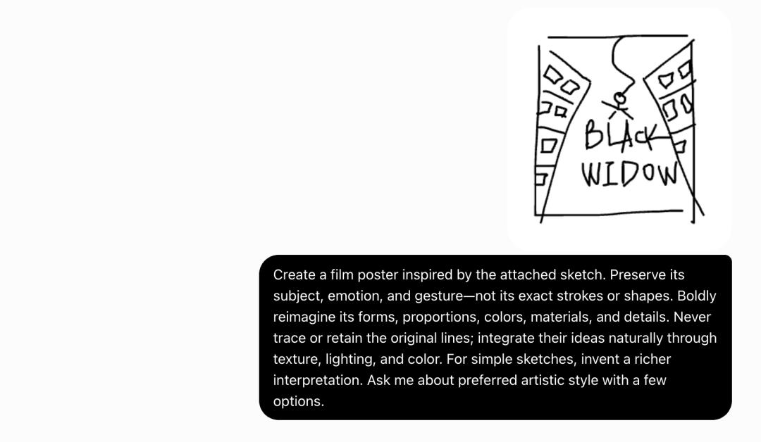
I also left a lot of leeway in the prompt, only requiring the AI to retain the core theme, mood and action, and allowing it to reorganize the shapes, materials and details. ChatGPT then offered 5 different artistic directions for me to choose from.
I picked the psychological thriller style typical of art house films, and the retro poster style. One of the outputs lowers the color saturation, fills the gaps between buildings with gray mist, making the suspended figure look exceptionally isolated. The other dyes the sky red, adds a full moon, paper creases and worn edges, giving the whole image the printed texture of an old movie poster.
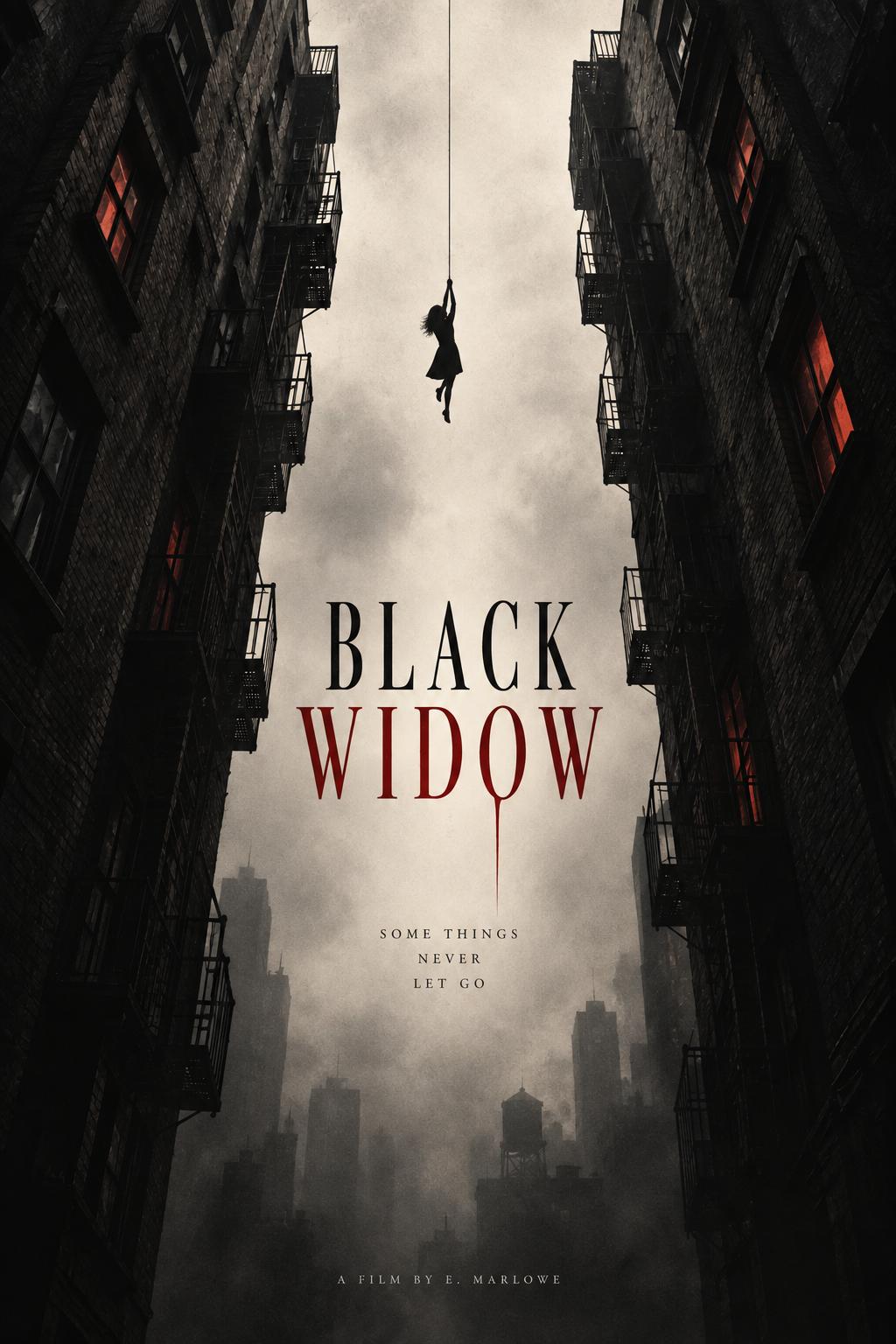
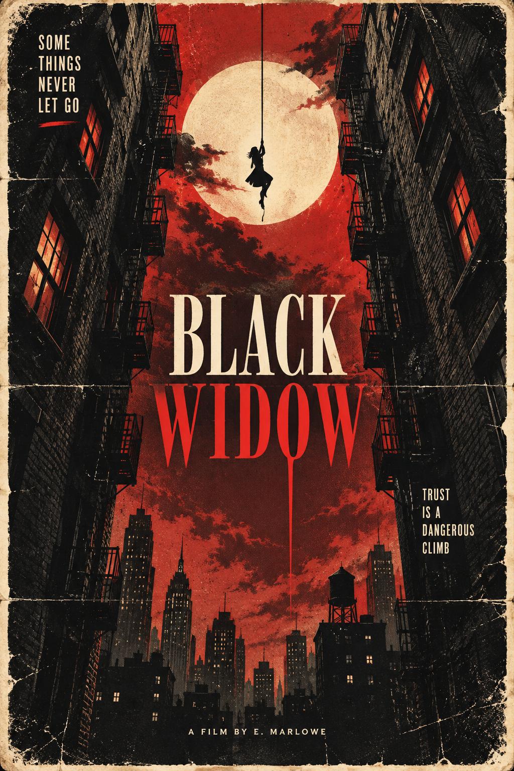
The two images have different styles, but both clearly retain the composition of the original sketch. This process is a bit like playing the game "Pictionary": after the AI guesses your idea correctly, you can continue to iterate and adjust the output.
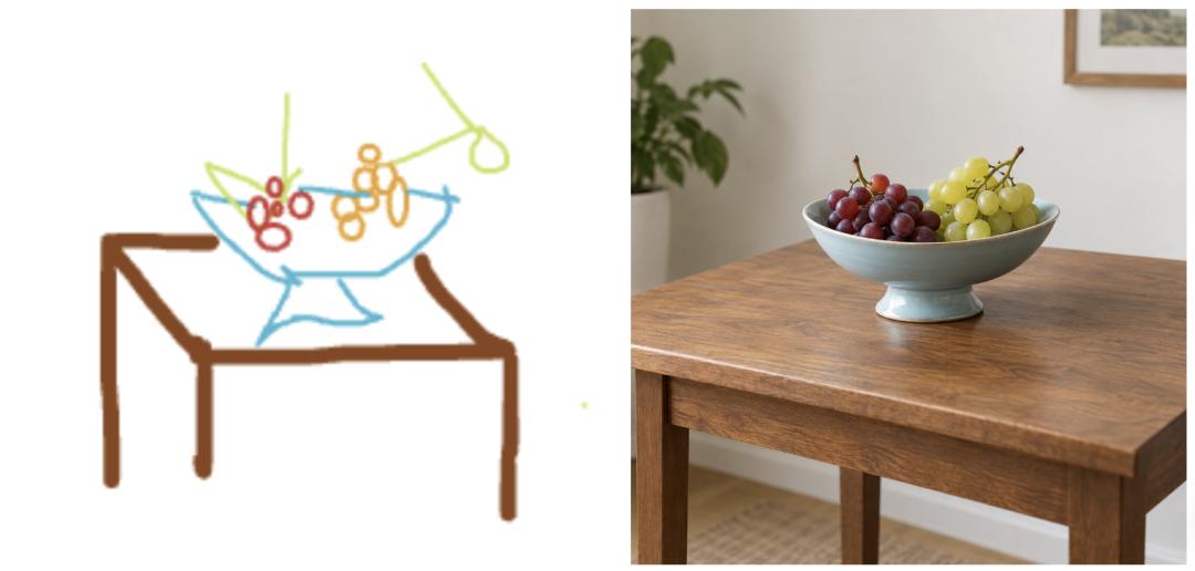
I also drew a still life sketch: a few brown lines form a table, blue lines outline a fruit plate, and colored circles represent grapes.
The generated image adds wood grain, ceramic glaze and natural side lighting, turning the original naive, clumsy lines into a decent, realistic still life photograph.
Users who have a clear picture in mind but don't know how to describe it accurately can try this new feature more often.
Change the Camera Angle
Rose and Jack look so beautiful in the classic scene from Titanic, who wouldn't want to admire them from every possible angle?
I asked Images 2.5 to generate 8 different perspectives of the iconic scene where the two stand at the bow of the ship in *Titanic*.
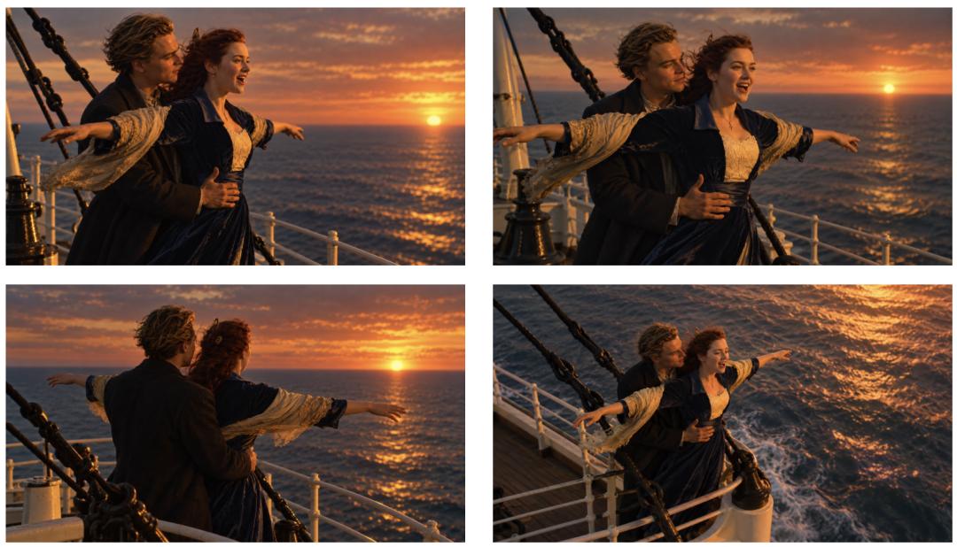
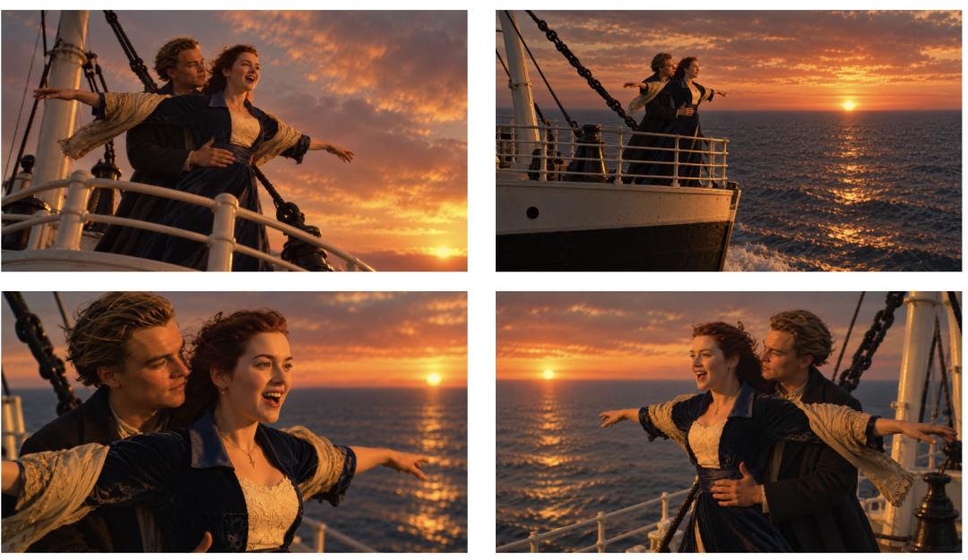
From side views, back views, to high-angle shots, low-angle shots and long shots, the size of the characters in the frame changes continuously. Rose's dark coat and light-colored scarf, Jack's hairstyle, and the orange sunset over the sea form a consistent visual thread across all outputs.
At the display size, the facial features of the characters are largely consistent, and their clothes and actions do not change completely as the camera position shifts. Close-ups are suitable for viewing facial expressions, while long shots show the relationship between the bow and the sea. When several of these images are put together, they look just like a set of consecutive camera shots.
This set of images is mainly based on the same location and the same pose, and does not cover large changes such as outfit swaps, heavy object occlusion, or cross-scene transitions. It is suitable for observing the consistency of outputs when the camera position changes, but cannot be regarded as a comprehensive verification of character consistency across different scenarios.
Another Vlog storyboard puts the whole day of a short-haired girl into 16 panels: waking up, sorting out personal belongings, going out, taking a car, eating, doing activities by the sea, and finally returning to her room. The scarf, hairstyle and coat run through multiple scenes, and the frames are also interspersed with close-ups of landscapes and objects.
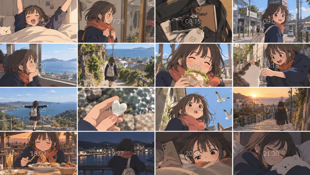
As a preliminary planning tool, it can already help us judge the sequence of the itinerary and the rhythm of the shots.
Images 2.5 performs excellently in narrative generation. If you want, you can then use Seedance 2.5 to create complete dynamic scenes.
Quite Artistic
Imagess 2.5 also has an improved understanding of complex artistic styles.
After modifying an ordinary travel selfie, the clothes of the two people are added with colorful crayon textures, and flowers, hearts and handwritten words appear around them. The faces, skin and distant mountains still retain the photographic texture, while the rough lines follow the outline of the body, adding a playful touch to the image.
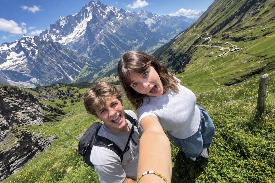
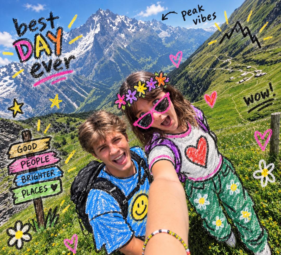
Prompt:Keep the original photo fully realistic and unchanged. Add playful hand-drawn doodles directly onto the photo, as if someone casually drew over a printed snapshot with crayons and markers. Randomly choose 2–4 creative interventions based on the scene: redraw parts of the clothing as colorful crayon outfits, extend or replace accessories with doodle versions, add funny objects or props, simple hearts, stars, arrows, utensils, flowers, symbols, or short handwritten annotations. Use rough black outlines, chunky uneven strokes, flat bright colors, visible waxy crayon texture, imperfect childlike coloring, and slightly messy hand-drawn edges. Make the doodles naturally interact with the people and objects in the photo and follow their body shapes, poses, and perspective. Keep faces, skin, hair, hands, and the environment photorealistic. Do not cartoonize the entire image. Each photo should receive a different, spontaneous combination of doodles, like a quirky personal photo diary.
The illustrations generated based on the scene from the Korean drama *Typhoon Trading Company* retain the dynamic of the two people looking at each other through a door, and remove the cluttered textures in the original photo.
The long prompt clearly specifies geometric simplification, limited color palette, negative space and weak perspective. The model follows these requirements, and human users still remain in control of deciding what details are worth retaining.
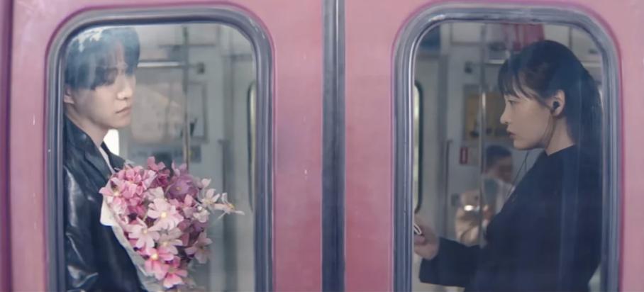
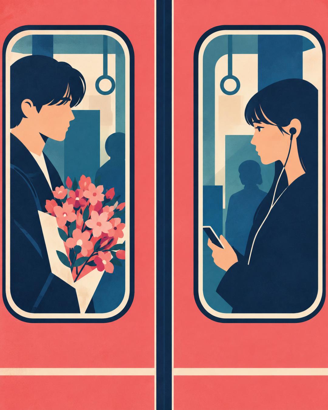
Prompt @ukiyo_teyanday: Create a refined illustration with a highly flat graphic composition. The image should have the feel of a high-end mid-century modern editorial poster, but place more emphasis on flat design, planar composition and abstract graphic balance. Style: - Extremely flat vector illustration - Strong planar composition - All objects are geometrically simplified - Minimal depth of field - Compressed space - Almost no perspective - Almost no volume modeling - No realistic lighting - No realistic shadows - Use color blocks instead of rendered forms - Bold outline design - Clear edges, poster-like visual structure - Elegant negative space - Graphical, connotative, art-directed composition Important composition rules: Treat the entire image as a flat arrangement of shapes on a two-dimensional plane. Do not build realistic scenes with depth. Do not emphasize three-dimensional forms. Flatten the foreground, middle ground and background into interlaced color blocks. Visual language: - Use overlapping geometric color blocks - Simplify objects into symbols and outlines - Simplify human anatomy, faces, hands, buildings, furniture, plants, food and vehicles into minimalist flat shapes - Use collage-like composition - Apply the style of screen printing/lithography - Use strong cropping - Use asymmetric balance - Use rhythmic arrangement of shapes - Use graphic repetition where appropriate - Make the image feel like a deliberately designed surface, not an observed reality Perspective: - Prefer front-facing or nearly planar simplified perspectives - Top-down perspective is also acceptable - Avoid strong realistic perspective - Avoid deep spatial depth - Avoid depth like a movie Color: Use a restrained and vivid palette of 4-6 colors. For example, deep navy blue, warm ivory, vermilion, cobalt blue, emerald or turquoise, mustard yellow, coral pink. Use 1-2 main colors, with the rest as accents. Use solid color fills. Use minimal gradients only when absolutely necessary. Avoid: - Photorealism - 3D rendering - Realistic textures - Oil painting style - Cinematic lighting - Highly glossy digital effects - Excessive details - Realistic cast shadows - Soft depth of field atmosphere - Anime style - Cute mascot shapes. Ideal effect: Flat, graphical, planar, poster-style, editorial-style, stylized, design-rich, modernist, mature, visually impactful, exquisitely composed. The final image should give the impression of a carefully designed two-dimensional graphic work, not a realistic illustration. Vertical 4:5 aspect ratio. Do not add text unless specifically requested.
In the following set of sample images, the