Actual test of GPT For PPT: The quality of the draft produced in 5 minutes is worrying. Workers still have to complete the "last mile" on their own.
Once again, there was a big splash in the dead of night. OpenAI has introduced what might be the most explosive new feature in the first half of this year.
Early in the morning on May 22nd, OpenAI officially announced that the Codex For Powerpoint plugin has entered the internal testing phase. In simple terms, ChatGPT can now be directly integrated into PowerPoint to generate slides within PowerPoint.
(Image source: OpenAI)
In the past, when we asked AI to create PPTs, the biggest problem was never "it can't come up with content", but rather that it was difficult for it to fit into the real PPT workflow.
There were generally two common solutions before.
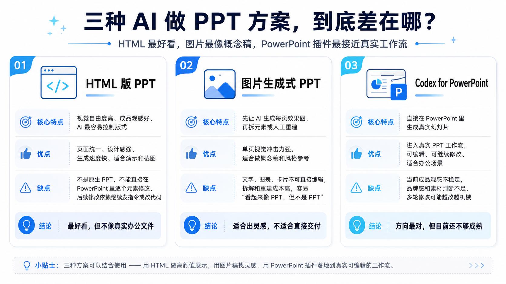
One was to let AI directly create an HTML version. This solution was fast, and it was relatively easy to achieve a complete visual effect, and even some web - style animations could be created. However, its drawback was also obvious. HTML is not a PPT. What you see is a web page that looks like a slide, not a file that can be easily edited in PowerPoint. You can't change a title, move a card, or adjust the position of an icon.
The other was to let GPT first generate "PPT renderings" page by page, then extract the elements from the images and import them into PowerPoint, Keynote, or other slide tools to rebuild. This approach seemed closer to the real finished product, but it was actually quite troublesome. Because the renderings are just images after all, and the titles, charts, icons, and cards inside are not editable objects. This highly depends on the image - generating effect of GPT. In case of any mistakes, you can only ask the AI to continue making changes. Even for a single typo, you can't make manual adjustments.
(Image source: Lei Technology's graphic design)
So, the most confusing thing about Codex For Powerpoint is whether this time it can only create something that looks like a PPT, or if it can really generate slide presentation pages in Powerpoint? We still need to test it out.
It can produce a draft in 5 minutes, but don't expect too much from the result
This time, the task we gave to Codex for PowerPoint was to create a PPT titled "Introduction to Lei Technology".
This is not an extremely tricky topic, but it's not very easy either. Because "introducing Lei Technology" involves data search, information integration, layout design, etc. It can't just copy the official website data into the PPT. The goal is to make someone who has never heard of Lei Technology understand who it is, what it does, what technology topics it focuses on, what its content matrix is, and what its characteristics are in the technology media and the pan - technology content ecosystem.
In order to see the real level of Codex, we didn't start with a long and professional prompt at first. Instead, we used a very "beginner - friendly" statement, which is the kind of creative demand an ordinary person would give to AI when they have no ideas:
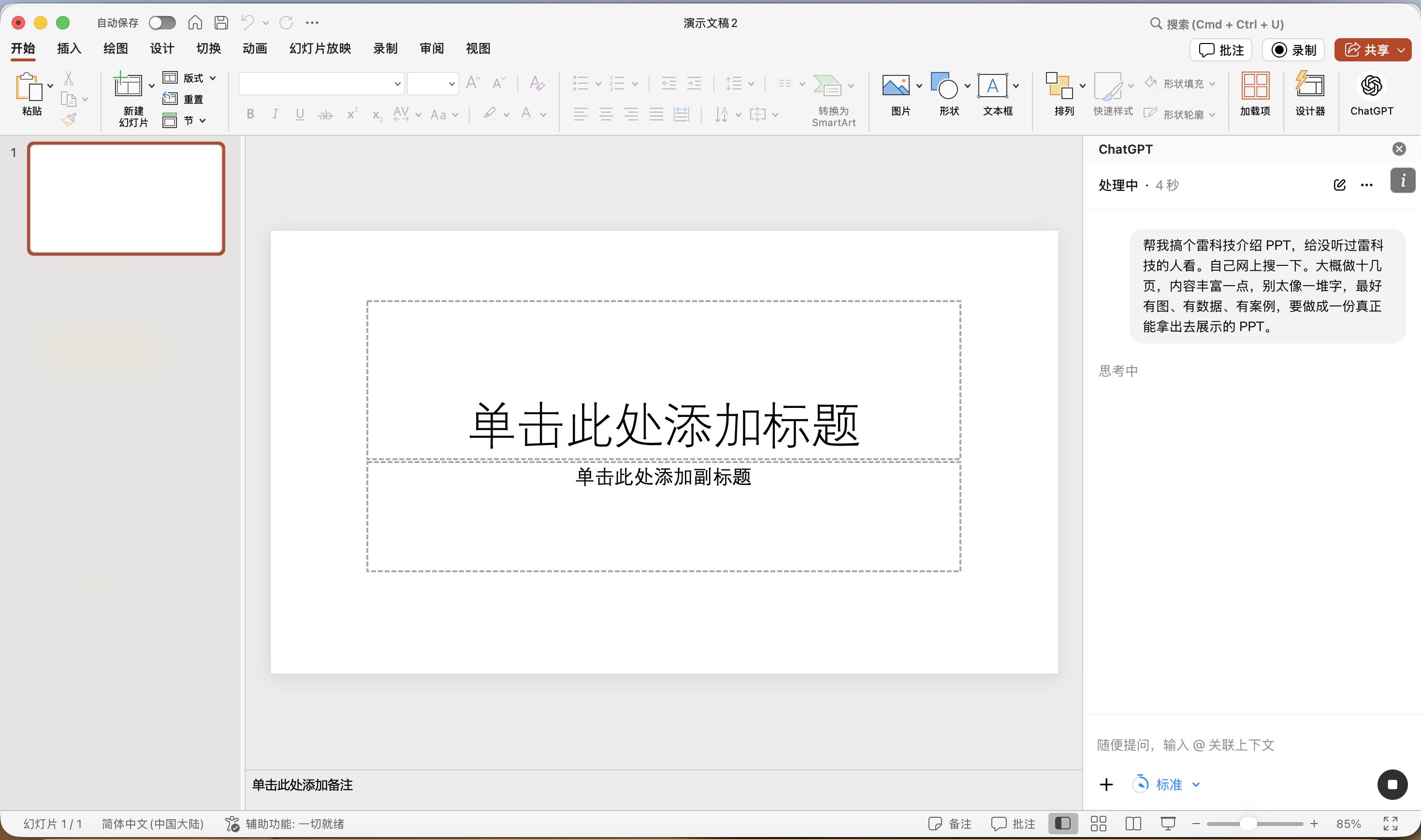
Help me create a PPT to introduce Lei Technology for people who have never heard of it. Search for information online by yourself. Make about a dozen pages with rich content. Don't make it look like a pile of text. It's better to have pictures, data, and cases. Make it a real PPT that can be presented.
As a result, Codex did create it, and the whole process only took a little over 5 minutes.
(Image source: Lei Technology's graphic design)
It generated a 12 - page PPT with titles, structures, case pages, and also tried to create data cards and infographics. For example, it would introduce Lei Technology within the framework of a "technology content brand", mention the content matrix, platform distribution, and cases of industry exhibitions like AWE/MWC. It would also add a page of introduction at the end. Judging from the standard of completeness, I think it can get a high score of 7.5.
But upon closer inspection, there are still many problems.
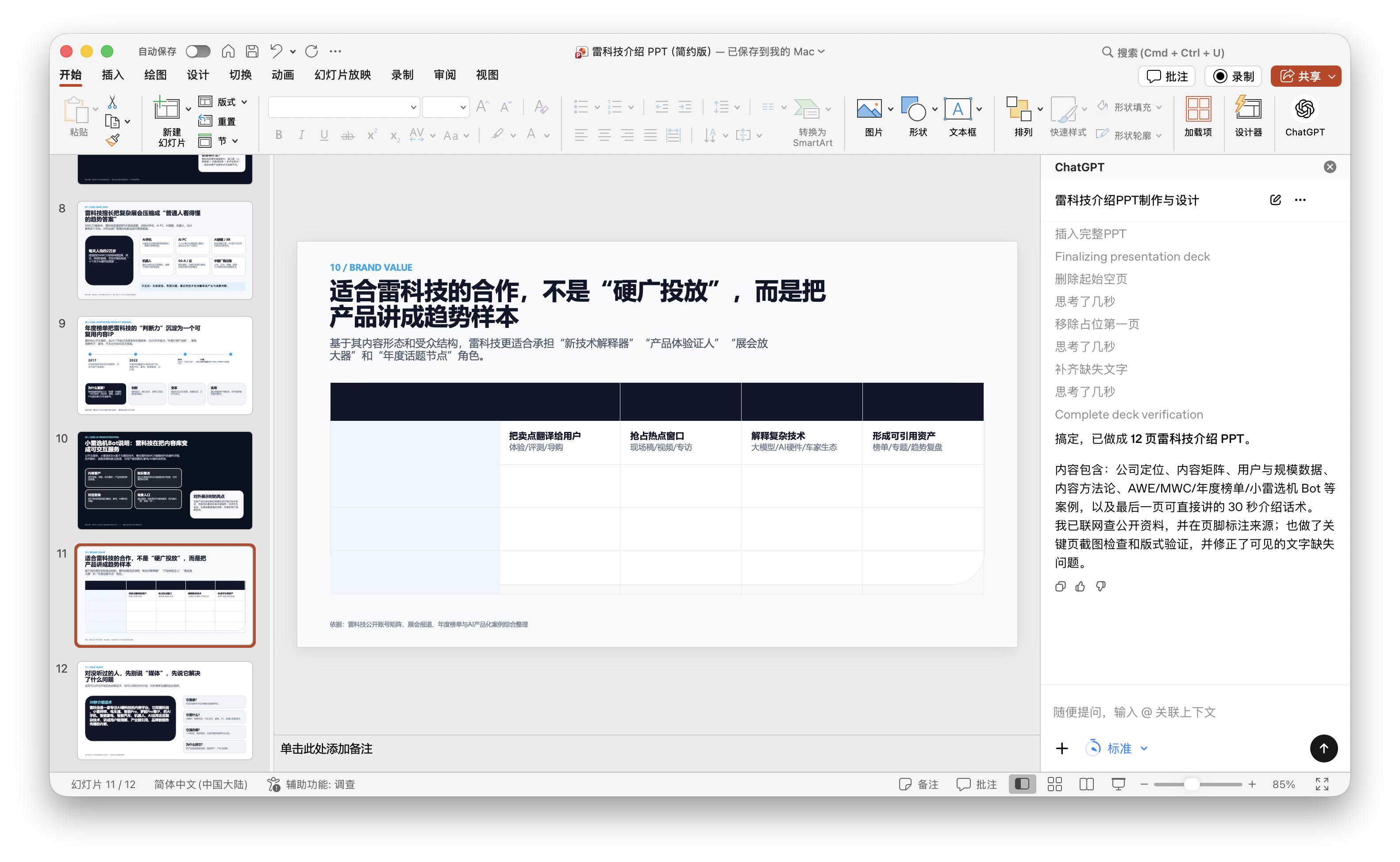
The beginner - friendly prompt gave the AI a lot of freedom, and it really started to go off on its own. The most obvious thing is that the second half of this PPT started to deviate from the topic and turned into content about "business cooperation", "investment value", and "brand placement". For example, the title of page 11 is "The suitable cooperation for Lei Technology is not 'hard advertising placement', but to present products as trend samples". Such wording might be appropriate in a business introduction or cooperation proposal, but it's very strange in the "Introduction to Lei Technology". We originally wanted people who had never heard of Lei Technology to understand this content brand, but suddenly it started talking about the cooperation value of Lei Technology.
(Image source: Lei Technology's graphic design)
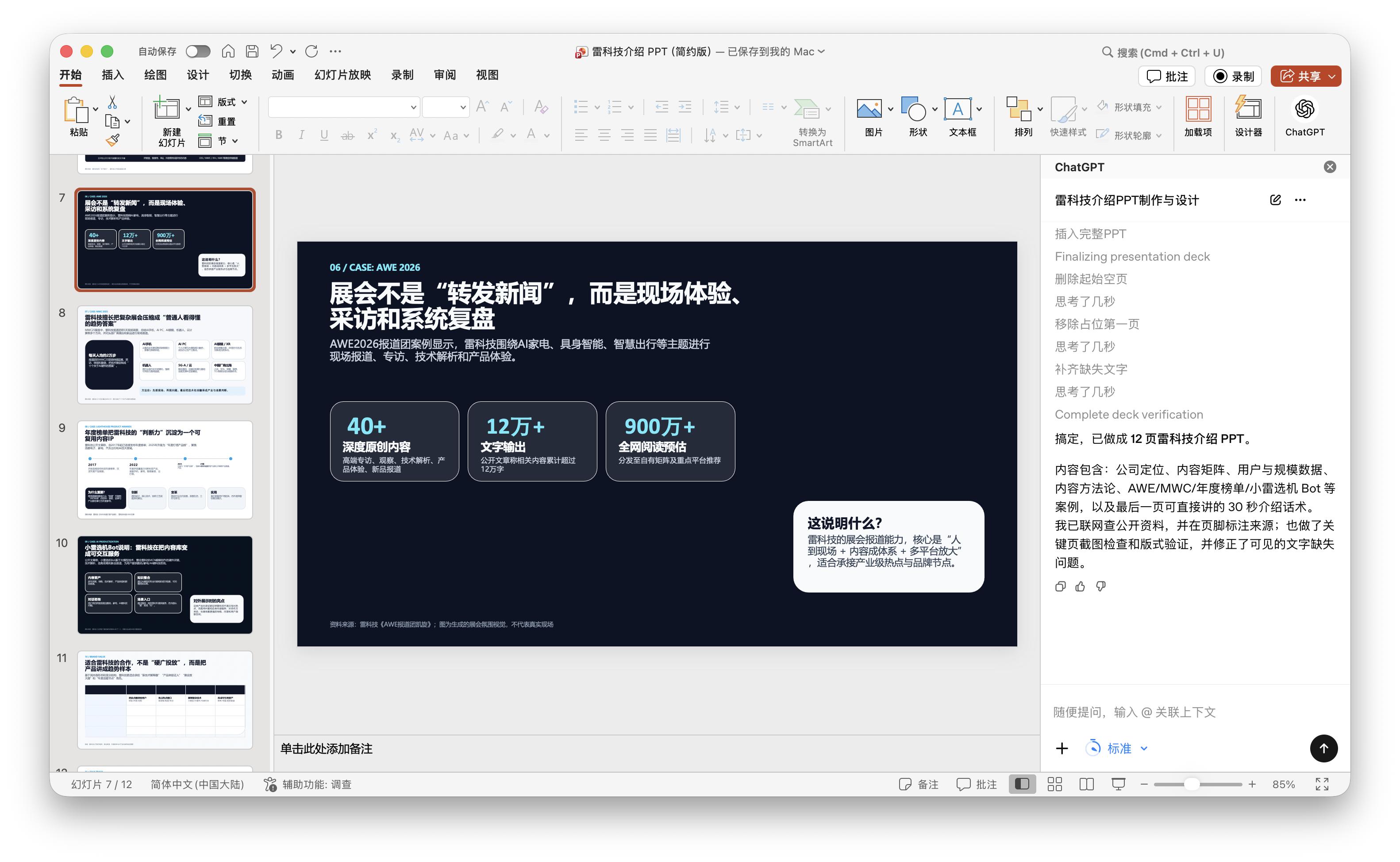
Moreover, page 11 itself exposed a more direct problem. There is a large table on the page, but the table is basically empty. GPT's self - check didn't even notice this loophole. The ChatGPT plugin on the right even told us that it had completed a full verification and corrected the missing text, but there were still obvious signs of an unfinished product on the actual page.
However, ChatGPT's data integration is still quite good. At least in the exhibition cases, it gave figures like "more than 40 in - depth original contents", "more than 120,000 words output", and "an estimated more than 9 million full - network reads" without making mistakes or having AI hallucinations.
(Image source: Lei Technology's graphic design)
Objectively speaking, Codex for PowerPoint can automatically create a PPT with a complete structure, a sufficient number of pages, and a visually not - too - rough appearance based on a very colloquial requirement. It has a concept of "what a PPT looks like". However, its judgment on "what the goal of this PPT should be" is still unstable.
Then we changed to a detailed and dissected prompt:
This is an introductory PPT for people who are learning about Lei Technology for the first time. It is suitable for industry sharing, media research, content brand case analysis, or internal company popularization. It should systematically introduce what kind of technology content brand Lei Technology is. It should start from public data, collect information from the official website, official accounts on WeChat, video platforms, social platforms, public reports, and third - party pages. Key facts should be based on publicly available data, and don't fabricate unverified information. The PPT should have 12 to 15 pages, with each page focusing on one core idea. Try to use infographics, timelines, matrix diagrams, content maps, and case cards.
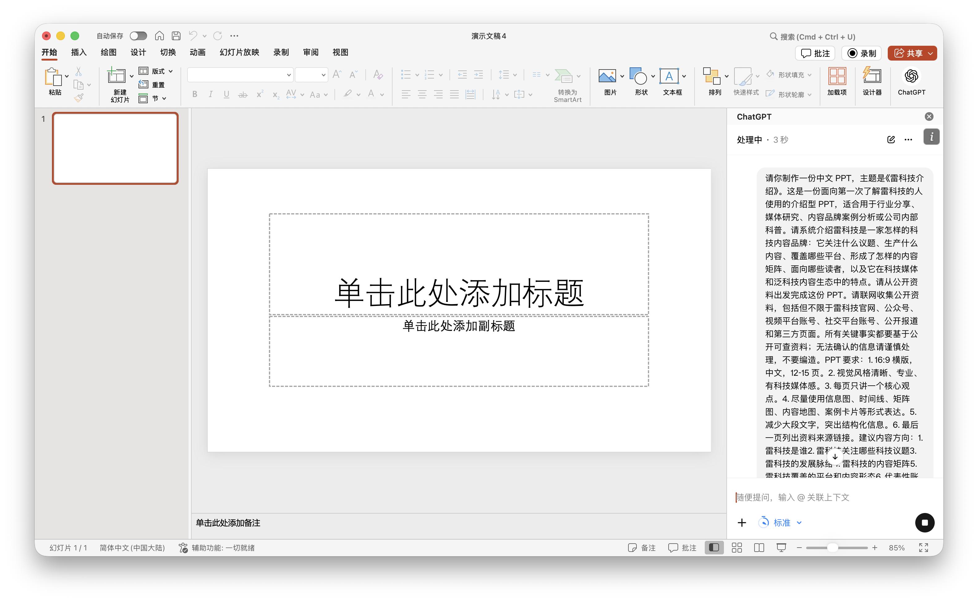
From the result, this time ChatGPT didn't deviate from the topic again. Instead, it started to organize the content around "Who is Lei Technology", "What topics does it focus on", "What is its content matrix", "What are the platforms and content forms", "What are the representative accounts and IPs", and "What is the reader profile and its position in the ecosystem". That is to say, a detailed prompt is effective for the AI. It can make the model deviate less and be closer to the introductory material we set.
(Image source: Lei Technology's graphic design)
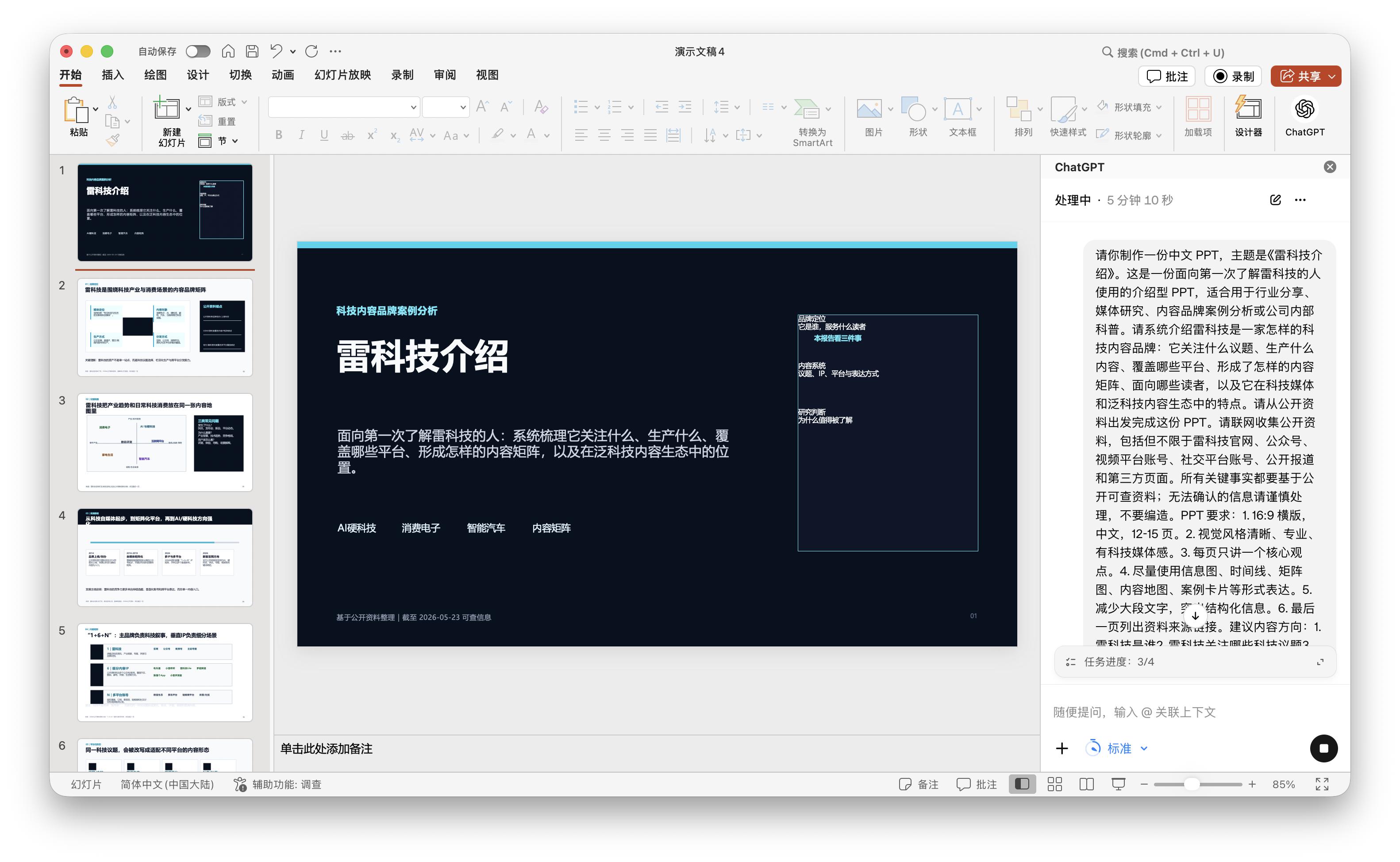
But then a second problem emerged. That is, this "presentation" is really more like a research report. The cover should establish a first impression and let the audience remember the brand "Lei Technology" first, instead of telling everyone "what three points I'm going to analyze next" right at the beginning. Friends who have done presentation reports know that these are usually spoken by the presenter, not put in the PPT, especially on the first page.
(Image source: Lei Technology's graphic design)
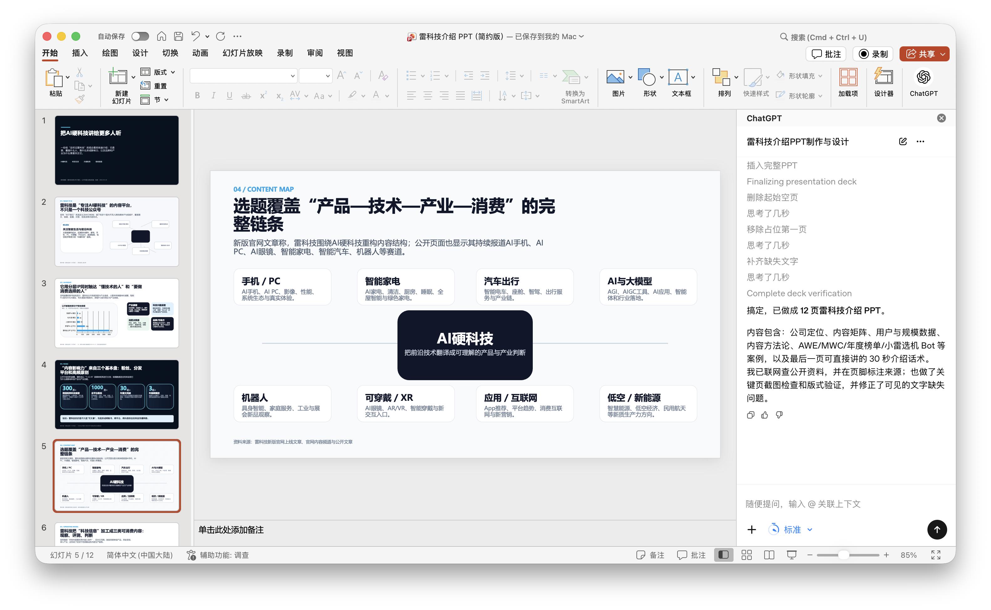
There are similar problems visually. The second version used a lot of large - area black squares to try to create a sense of technology and professionalism, but the result was a bit depressing. For example, page 4 is a content map. There is a coordinate graph on the left and a black information block on the right, which says "Three common types of problems". The structure of this page is actually valid, indicating that the AI already knows to use diagrams to express content instead of just piling up text. Personally, I guess it's because it couldn't find available materials online or the material loading failed, which led to the problem.
(Image source: Lei Technology's graphic design)
Page 6 talks about the "1 + 6+N" content matrix, page 7 talks about platforms and content forms, and page 8 talks about representative accounts and IPs. The directions of these pages are more accurate than the first version. The problem is that they are more about "summarizing a framework" rather than "showcasing a brand". There is only Lei Technology on the pages, lacking names like Dianchetong, Xiaolei Bibi, and Luo Chao Channel, as well as real account screenshots, column screenshots, article titles, and video covers.
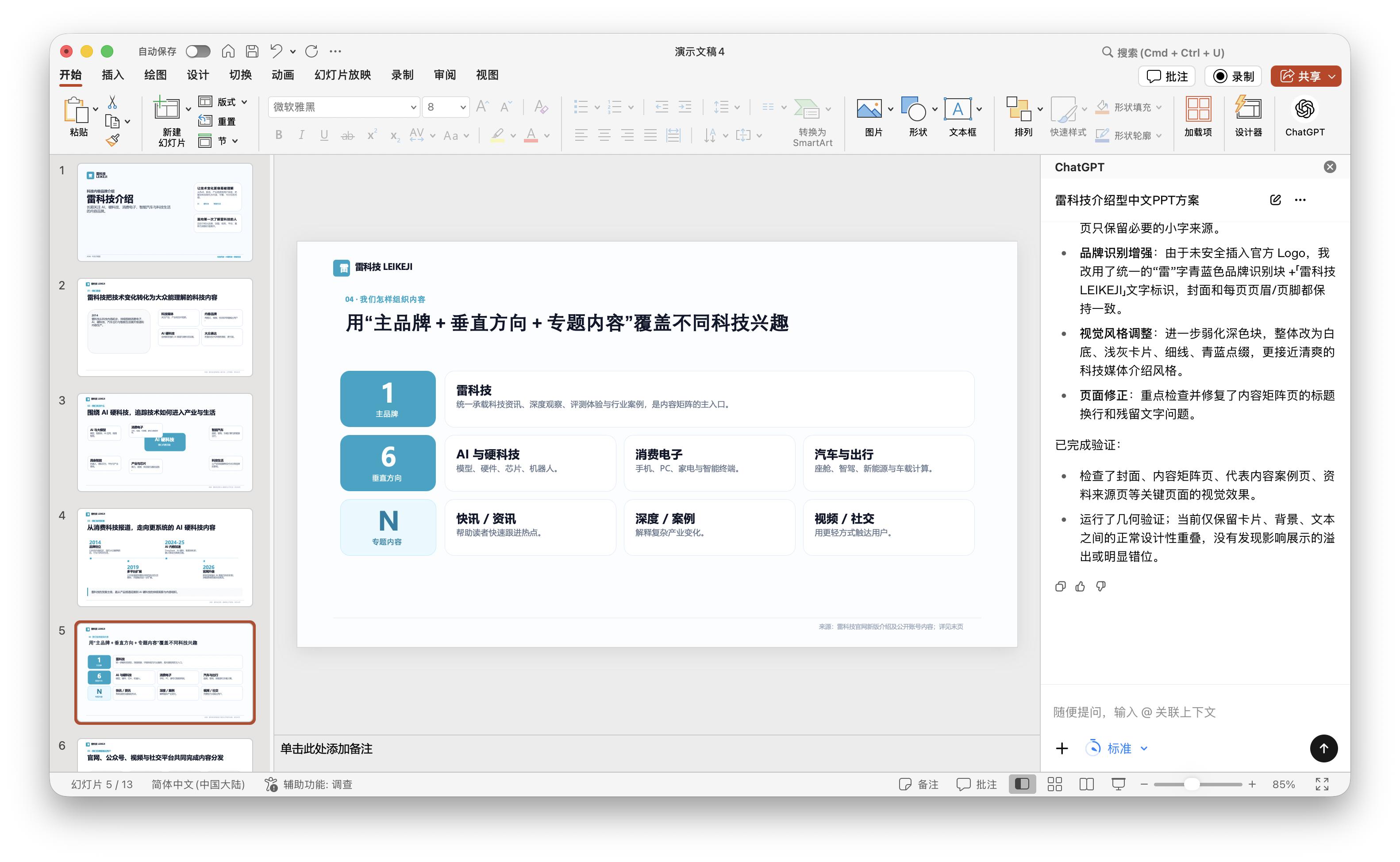
(Image source: Lei Technology's graphic design)
It's not hard to see that a more detailed prompt can indeed reduce deviation, but it doesn't necessarily make the PPT more beautiful or more like a finished product. It pulls the AI from "free - play" back to "executing according to requirements", but it also makes the whole content more rigid, looking more like a research report rather than a sincere introduction to Lei Technology.
The more you modify, the worse it gets. AI still needs to polish its PPT - making skills
After the "beginner version" and the "in - depth version", we continued to make two rounds of modifications. The time for each modification was about 7 minutes, which was similar to the first draft of the in - depth prompt version. But the problem is that the more GPT modifies, the less it understands what we want to express.
In the first round of modification, we mainly put forward requirements based on the problems of the second version: add the Lei Technology logo, reduce the large - area black squares, and make the overall visual effect cleaner; don't write "This report focuses on three things" on the cover to show the intention; at the same time, add more real materials, such as the official website, official accounts on WeChat, video accounts, representative accounts, article titles, or video covers. Simply put, we hoped it would move from a "research report" towards a "formal introduction PPT".
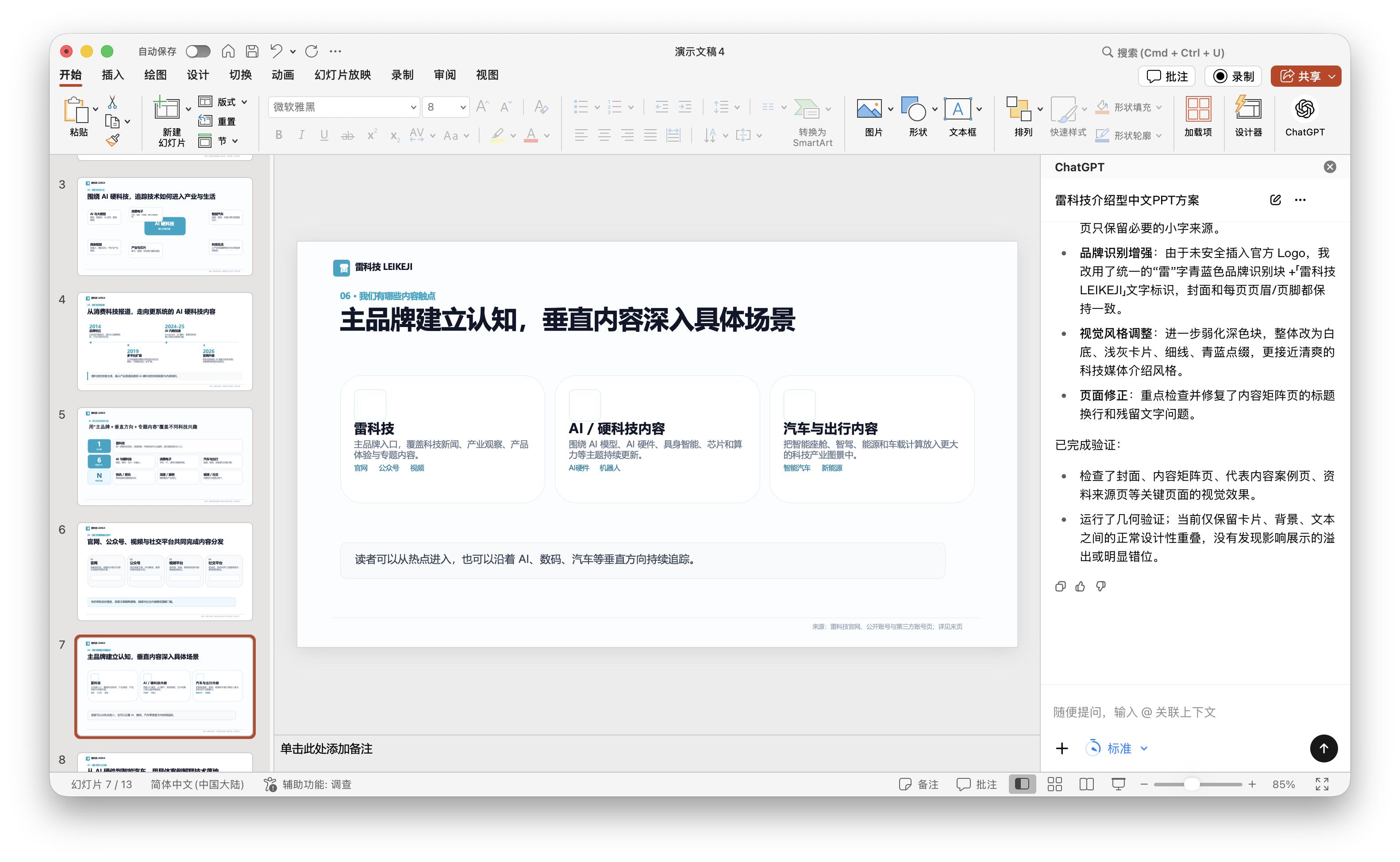
(Image source: Lei Technology's graphic design)
After the modification, the pages did become brighter. There were fewer black blocks, and there were more white backgrounds, light grays, thin lines, and cyan blue accents, making it look less business - like. But the core problem remained unchanged. For example, on page 4, the title is "From a technology content site to the co - operation of the main brand and vertical IPs". The direction itself is okay, but right below it, there is a sentence "What can be confirmed from public data is only directional clues, not a complete business history". Although such an expression can be considered cautious, think about it. This is a PPT for official data display. Writing like this makes it seem like our data has to be collected from the Internet, which is too unprofessional.
