There are too many advertisements and it is easy to trigger by mistake. Who on earth likes to use the pull-down search function anyway?
If you need to open a rarely used mobile App in the shortest possible time, how will you operate?
Will you quickly scroll to it through your own organized functional partitions or color categories, or pull out the app drawer and manually search by the first letter in the old-fashioned way?
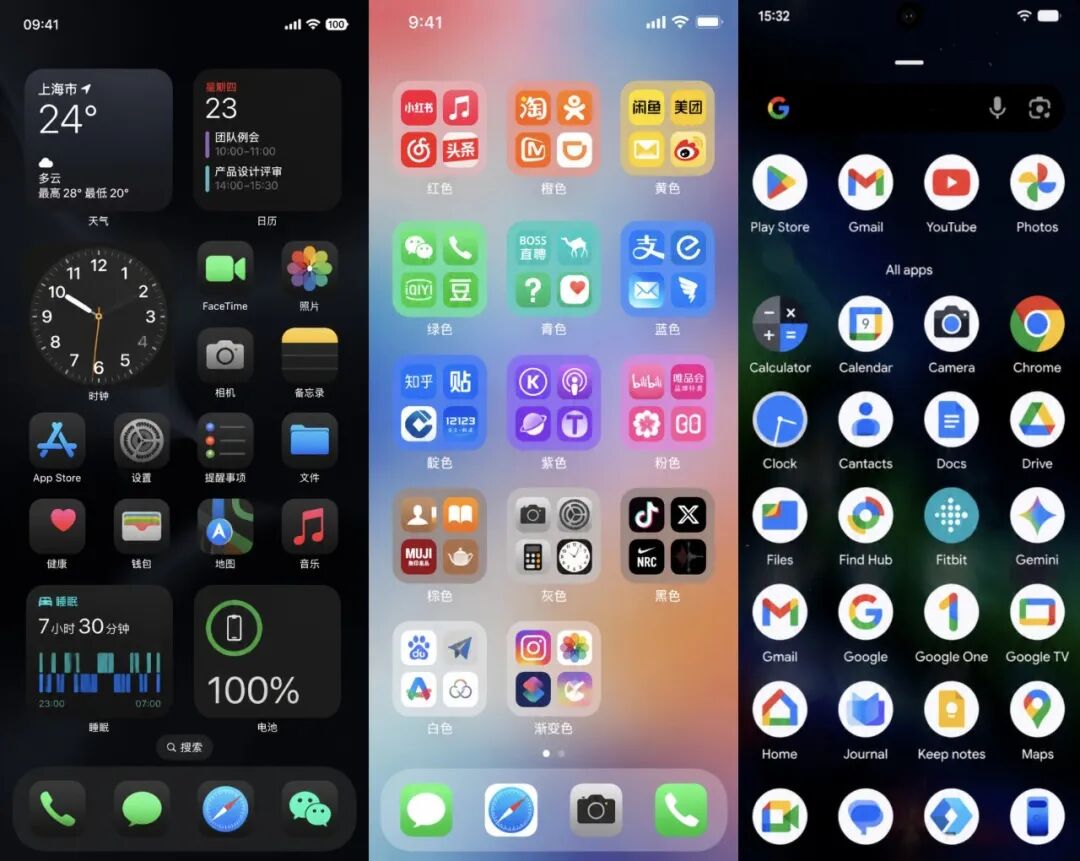
It's actually pretty fast once you get the hang of it. But if we expand the scope further, from finding Apps to finding files and images, there seems to be only one way left — pull down on the desktop to use the search function.
Speaking of which, you must quickly think of Apple's Spotlight. This feature was first introduced in iPhone OS 3 in 2009. Back then, users needed to swipe to the negative screen or double-click the home button to bring up the search page.

Google also launched a brand new feature called "Quick Search Box" in 2009, a few months later than Apple. The biggest difference from Spotlight is that it can search both local and online information.

Later, when iOS 7 was released, this operation was changed to the familiar pull-down search that everyone knows. But the search scope was limited to Apple's own supported apps, because at that time Apple had not opened the API interface to third-party apps on mobile phones.
This gave Android an opportunity to create differentiated features.
Google has been radical from the very beginning, opening APIs to third-party applications and allowing developers to integrate their app content into the search box. For example, if you install a note-taking app, as long as the developer adapts to the feature, you can directly search for the content of your notes. Back then, this fully matched the concept of "global search".
But do you think Google's openness is all a good thing?
Well, here comes the annoying ads!
Friends who used Android pull-down search in the early years must have a deep impression of the ads here, including all kinds of trending lists, invalid web search results, app recommendations...
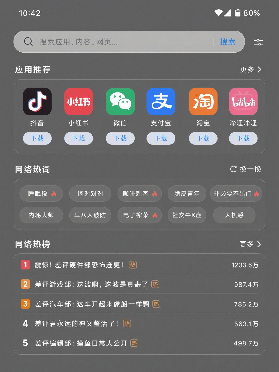
The content you actually want to search for is buried among all these irrelevant items, and since the search requires internet connection, the delay problem is sometimes quite obvious. In contrast, iOS was very restrained in the early days, with limited functions and information, and it was basically a local App integrated launcher.
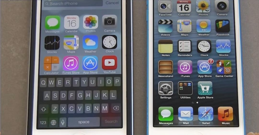
Both are mobile operating systems, and both have the pull-down search feature. Why did they take two completely different paths from the very beginning?
The fundamental reason lies in the different product logic. Apple's strategy is to make sufficient profits from hardware, and bind users to its ecosystem and increase product repurchase rates through fixed operation logic and easy-to-use tools.
Take Spotlight as an example, its call-up method is designed for convenience: swipe down on the desktop on iPhone, and press Command + Space on Mac. The search page either covers the full mobile screen or is located in the center of the screen, with extremely high interaction priority. Even now that Apple is vigorously promoting the commercialization of App Store ads, this system-level search remains very clean.
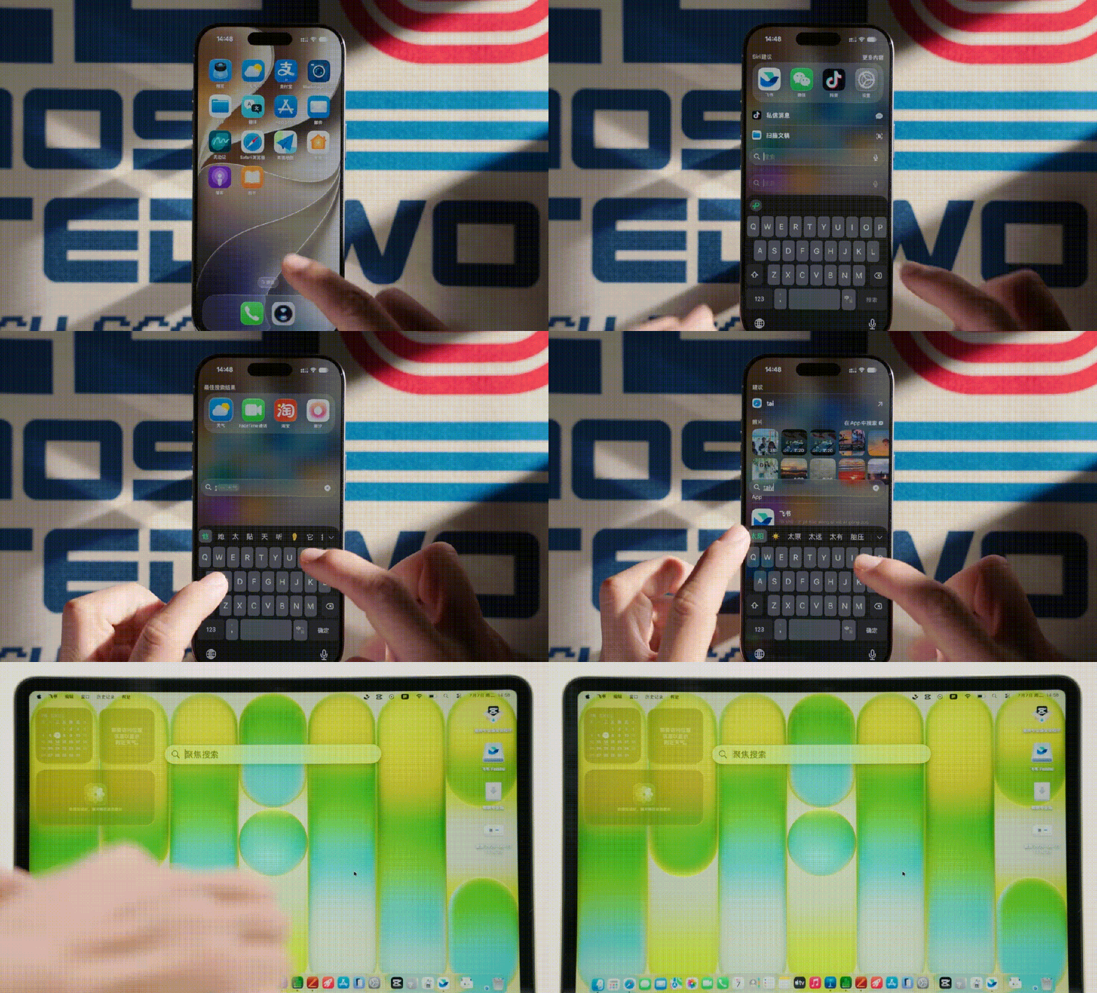
At the same time, it also plays a role in educating users, because the gesture of pulling down to enter the search page cannot be turned off. Even if you don't use this feature, you have to accept the occasional situation where you accidentally bring up this interface.
It is very convenient for overseas users. The usage rate of Apple's native apps such as Mail, Notes, Music, Podcasts and iMessage is extremely high, so Spotlight is very easy to use. It is equivalent to a unified entry point built on Apple's software ecosystem, through which you can access various data and information in daily apps, which is quite convenient.
But for users in China, we use more third-party Apps, and data is trapped in different apps and cannot communicate with each other. When we want to search for something, we usually take the initiative to open the specific App to search inside it.
So based on my observation of people around me, the most frequent usage scenario for iPhone's Spotlight in China is still to search for Apps.
Looking at domestic mobile phone brands in China, the entire market is highly competitive, and there were even fierce price wars in the early years. As a result, the profit of hardware is not that high, so manufacturers can only find ways to make more money from software and advertising.
As an important traffic entry point, the pull-down search naturally becomes a "good place" for manufacturers to implant ads to generate revenue.
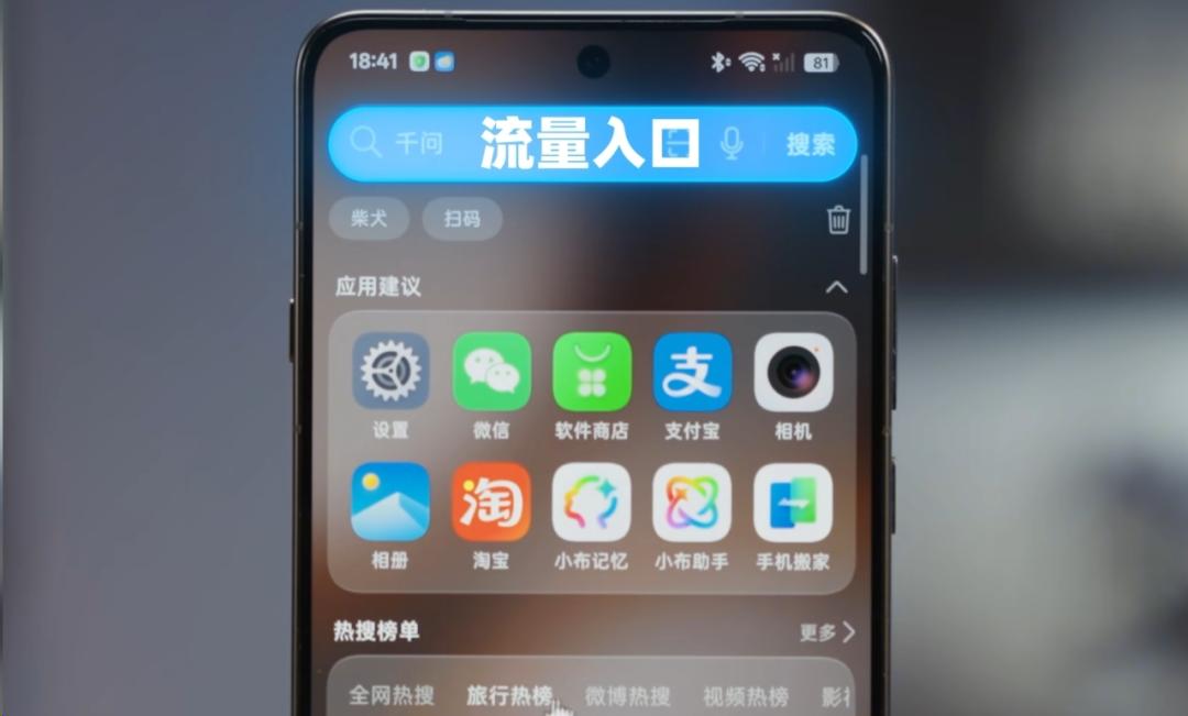
Even though users have been complaining for years, the ads are still enabled by default after all this time. I tested the mobile phones of Huawei, Xiaomi, OPPO and vivo that I have at hand, and all of them are in this situation.

On the other hand, the logic of domestic manufacturers is also different from that of Apple. They have realized that domestic users' demand for pull-down search is very polarized, so they provide more options. For example, you can turn off this feature, and set the pull-down gesture to bring up the control center or notification panel instead.
For example, my colleague Guotiao hates the pull-down search so much that he turns it off as soon as he gets a new phone. He even once said that mobile phones that cannot pull down to bring up the control center are very difficult to use.
Having said so much, the most critical question is: do you think the pull-down search features of different brands have really achieved differentiated performance?
I actually tested them all for you.
At this stage, the ads in the global search of various mobile phones can indeed be turned off, but only part of them.
Huawei had a lot of messy content at first, but after turning off all the irrelevant options, its search is relatively the cleanest. The other three brands have more or less retained some "private goods".

For example, vivo's quick apps and direct service access will still interfere with your search for legitimate content.
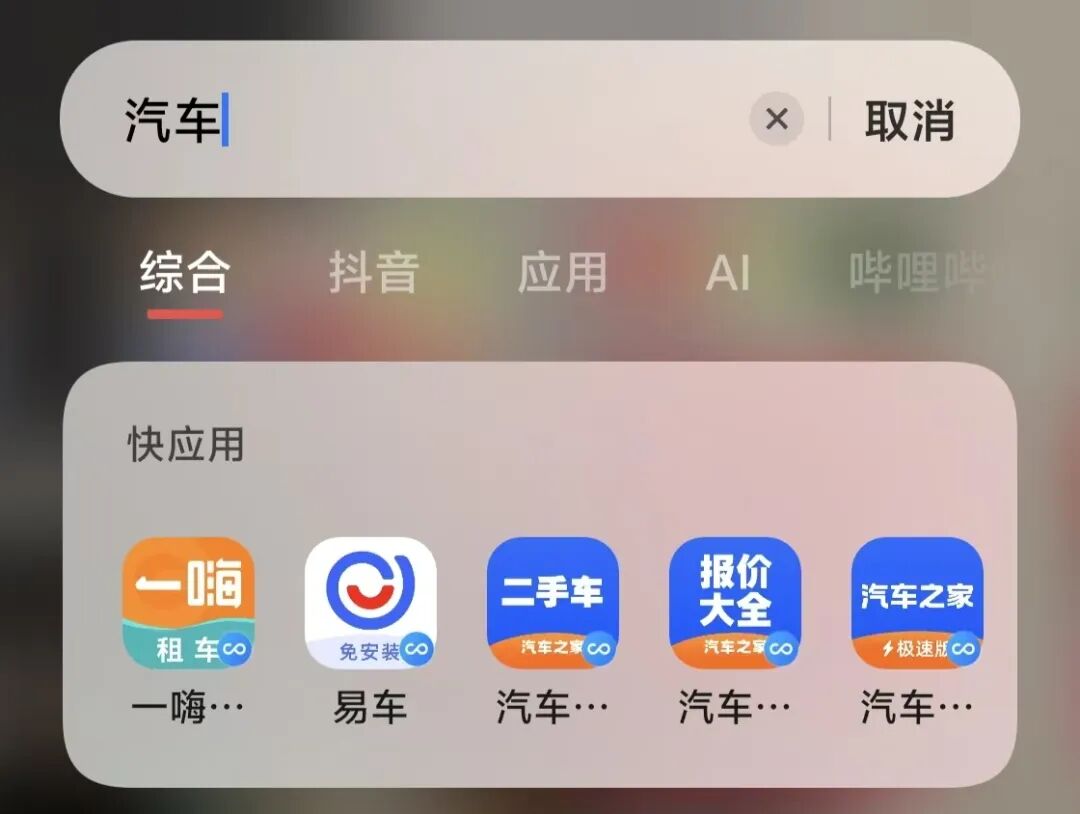
OPPO and vivo are very similar overall. Their top search bar integrates various third-party result pages, and the bottom of the default page also has uncloseable Douyin and Baidu search results.

Well, I know what you are thinking. I uninstalled Douyin on the vivo phone, and this page still exists. It's basically half of Douyin embedded in the system search.
The same is true for Xiaomi. Even if I have turned off the "recommend uninstalled apps" option in settings, app recommendation ads will still appear when I search.

However, Xiaomi and OPPO do a good job in one aspect: they set up a separate page for local device search results, which is quite clean and tidy.
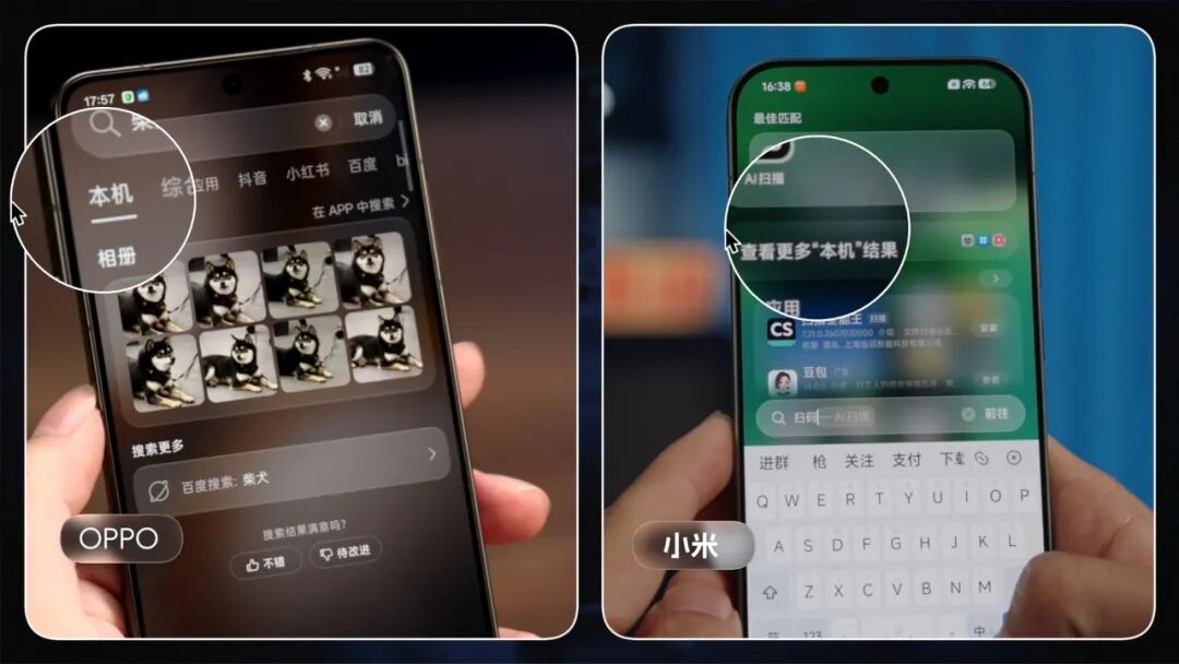
It would be even better if this local result page could be set as the first-level page, and then I can ignore the ads on other pages and pretend they don't exist.
When it comes to search capabilities, I think these brands are more or less at the same level, including Apple. In addition to basic searches by app name and file name, content inside documents can also be searched, and image search supports both semantic and text recognition.
In addition, for general services such as scanning QR codes, all brands can provide a jump button to quickly open the system scanner or Alipay scanner. But I only found the WeChat scan function in ColorOS, and it cannot be searched on other brands' systems.
iOS allows users to complete some simple functions directly in the search box without opening the App, such as using the calculator, converting exchange rates, etc.
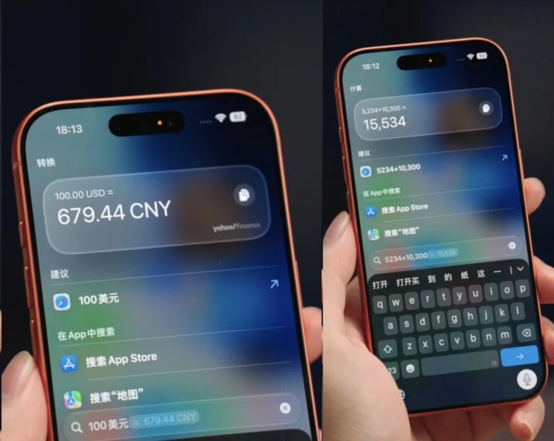
So don't look at the fact that the global search of Android and HarmonyOS now has an entry and layout very similar to iOS, they are essentially very different.
Apple prefers to build an index on the device side using fragmented information from local messages, emails, photos, documents and so on.
If in the future third-party Apps can also properly deconstruct, label and store their data into the Spotlight index, Apple's search capability will be extremely powerful, and once you get used to it, you will never want to leave its ecosystem.
Android and HarmonyOS are more straightforward. They tend to make search a "portal website" that integrates as many functional entrances as possible. It also has good search capabilities, and you can basically find all local and internet information here, but there is too much noise. The cloud is constantly correcting your information and feeding you more and more suitable personalized ads.
After reading all this, which brand's pull-down search feature do you prefer? Or do you turn it off as soon as you get a new phone? Feel free to share your thoughts in the comment section.
Image and material sources:
iPhone OS 3.0: The details
Quick Search Box (1.6),AndroidTips
This article is from the WeChat official account "X.PIN", Author: Xiao Ling, Editors: Guotiao, Milo, Mianxian, 36Kr is authorized to publish this article.